• Logo
    PaperBananaAI Academic Illustration Generator
Home
  • Home
  • Studio
  • Scientific Illustration Generator
  • Poster Maker
  • Diagram Maker
  • Figure Editor
  • Pricing
My Creations
  • My Creations
  • Invite Friends
LogoPaperBanana
HomePricingInvite Friends
LogoPaperBanana

PaperBanana - AI-powered academic illustration generator

support@paperbanana.me

AI Tools

  • All Tools
  • Text to Illustration
  • Scientific Illustration Generator
  • Figure Editor
  • Diagram Maker
  • Poster Maker

Support

  • About
  • Pricing
  • Contact

Legal

  • Privacy Policy
  • Terms of Service
  • Acceptable Use

© 2026 PaperBanana. All Rights Reserved.

PricingContact
Online box-and-whisker plot generator

Box Plot Maker for Excel and CSV Data

This Box Plot Maker turns pasted Excel values or uploaded CSV data into a box-and-whisker plot. Compare multiple groups, inspect quartiles and 1.5×IQR outliers, then export publication-ready SVG, PNG, or summary CSV.

Raw values, Excel paste, and CSVMultiple groups in one plotQuartiles, mean, and 1.5×IQR outliersSVG, PNG, and summary CSV export

Enter Raw Data and Choose Plot Settings

Paste labeled rows, wide spreadsheet columns, or a long group/value table. Blank cells are ignored.

Accepted formats: one column per group, group/value CSV, or “Group: 1, 2, 3” lines. Copy-paste directly from Excel or Google Sheets.

treatment-groups.csv

The values are valid. Review the quartile and whisker methods before reporting.

Your values are parsed and calculated in this browser. This tool does not upload them.

Live box plot and summary

36
Values
3
Groups
1
Outliers
R-7
Method

Five-number summary and mean

GroupnMinQ1MedianQ3MaxMeanOutliers
Control124247.755256.759154.751
Treatment A125560.56569.757865.50
Treatment B124856.2563.5728664.830

The default uses Excel QUARTILE.INC / R type 7 quartiles and Tukey 1.5×IQR whiskers. Different quartile conventions can produce different results for small samples.

Box plot basics

What a Box Plot Shows: Quartiles, Whiskers, and Outliers

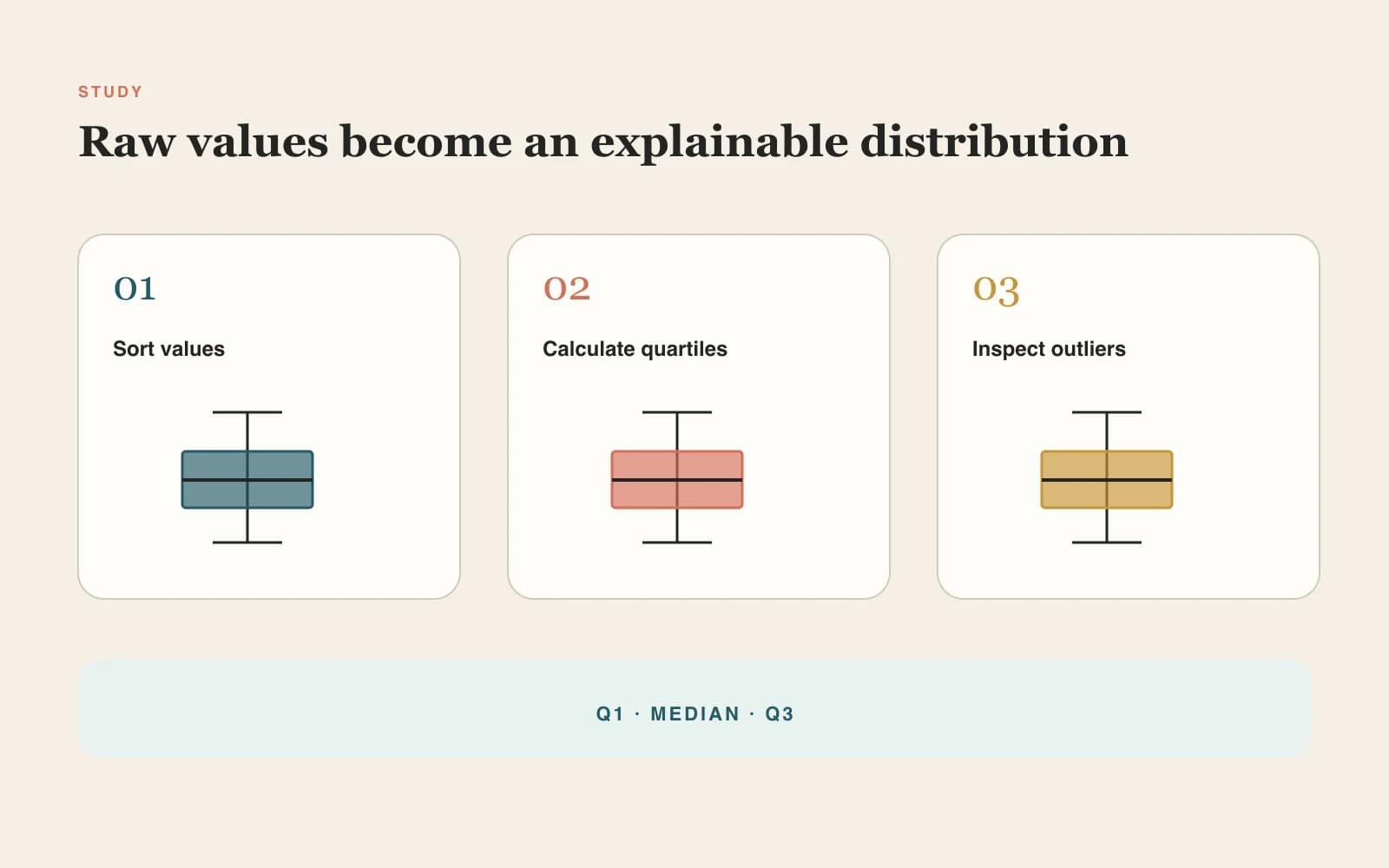
A box plot summarizes a numeric distribution with five landmarks: minimum, first quartile (Q1), median, third quartile (Q3), and maximum or whisker endpoints. The box spans the middle 50% of values, so its length is the interquartile range (IQR).

The median line shows the center without assuming a normal distribution. A long box, unequal whiskers, or a median close to one edge can reveal spread and skew that an average alone would hide.

With the common Tukey rule, whiskers extend to the most extreme observed values still within 1.5×IQR of Q1 and Q3. Values beyond those fences are plotted individually as possible outliers—not automatically treated as errors.

01

Q1

The 25th percentile and lower edge of the box.

02

Median

The 50th percentile and line inside the box.

03

Q3

The 75th percentile and upper edge of the box.

04

IQR and whiskers

IQR is Q3−Q1; whiskers show non-outlying range under the selected rule.
Calculation methods and references

Why Quartile Methods Can Produce Different Box Plots

Software packages do not all calculate quartiles and whiskers the same way. Choose a method explicitly and keep it consistent with the software or protocol used in your analysis.

Reference documentation reviewed: September 2026

ReferenceMethodWhat to verifyDocumentation

Reference

Microsoft Excel

Method

Inclusive quartiles

What to verify

The default linear interpolation matches QUARTILE.INC and the percentile convention commonly called R type 7.

Documentation

QUARTILE.INC

Reference

R graphics

Method

Tukey boxplot statistics

What to verify

Compare hinges, confidence notches, whisker endpoints, and outlier definitions with the boxplot.stats implementation.

Documentation

boxplot.stats

Reference

Vega-Lite

Method

Tukey or min–max whiskers

What to verify

Review the explicit distinction between 1.5×IQR box plots and whiskers that span the full observed range.

Documentation

Box plot documentation

Method labels make the calculation reproducible, but they do not replace a study-specific analysis plan or independent verification.

Box Plot Examples for Comparing Multiple Groups

Load any example into the maker to inspect the raw values, selected method, five-number summary, means, and outliers.

Built for real analysis tasks

From Statistics Homework to Research Figures

Use one transparent workflow to understand distributions, compare groups, check possible outliers, and prepare a figure for review.

Student using a box plot generator to compare raw values and a five-number summary

Students and statistics teachers

Paste classroom values, see quartiles and outliers immediately, and connect the finished plot to its five-number summary.

Biomedical researcher reviewing multiple box plots and outlier values

Biomedical and experimental researchers

Compare treatment, cohort, assay, or time-point distributions without turning individual extreme observations into invisible averages.

Data analyst using a Box Plot Maker with Excel spreadsheet columns

Excel and CSV data analysts

Move straight from wide or long spreadsheet data to a shareable visual and an auditable summary table.

Box Plot Maker capabilities

Build and Export a Box-and-Whisker Plot

Move from spreadsheet data to an auditable chart while keeping every statistical choice visible.

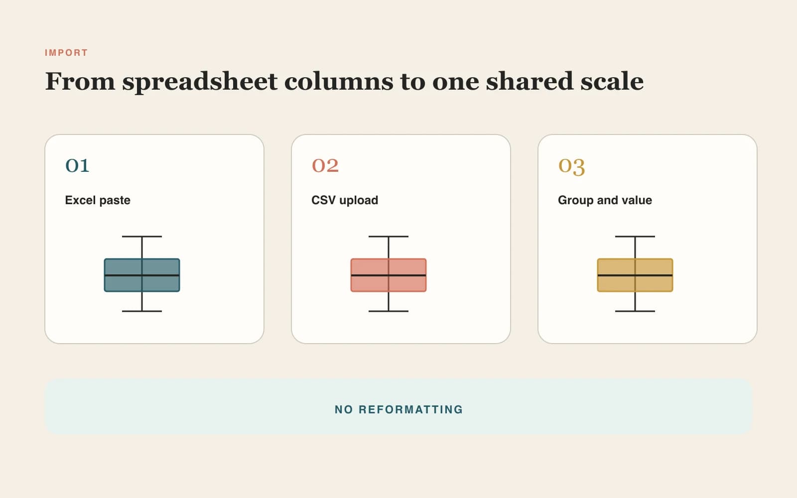
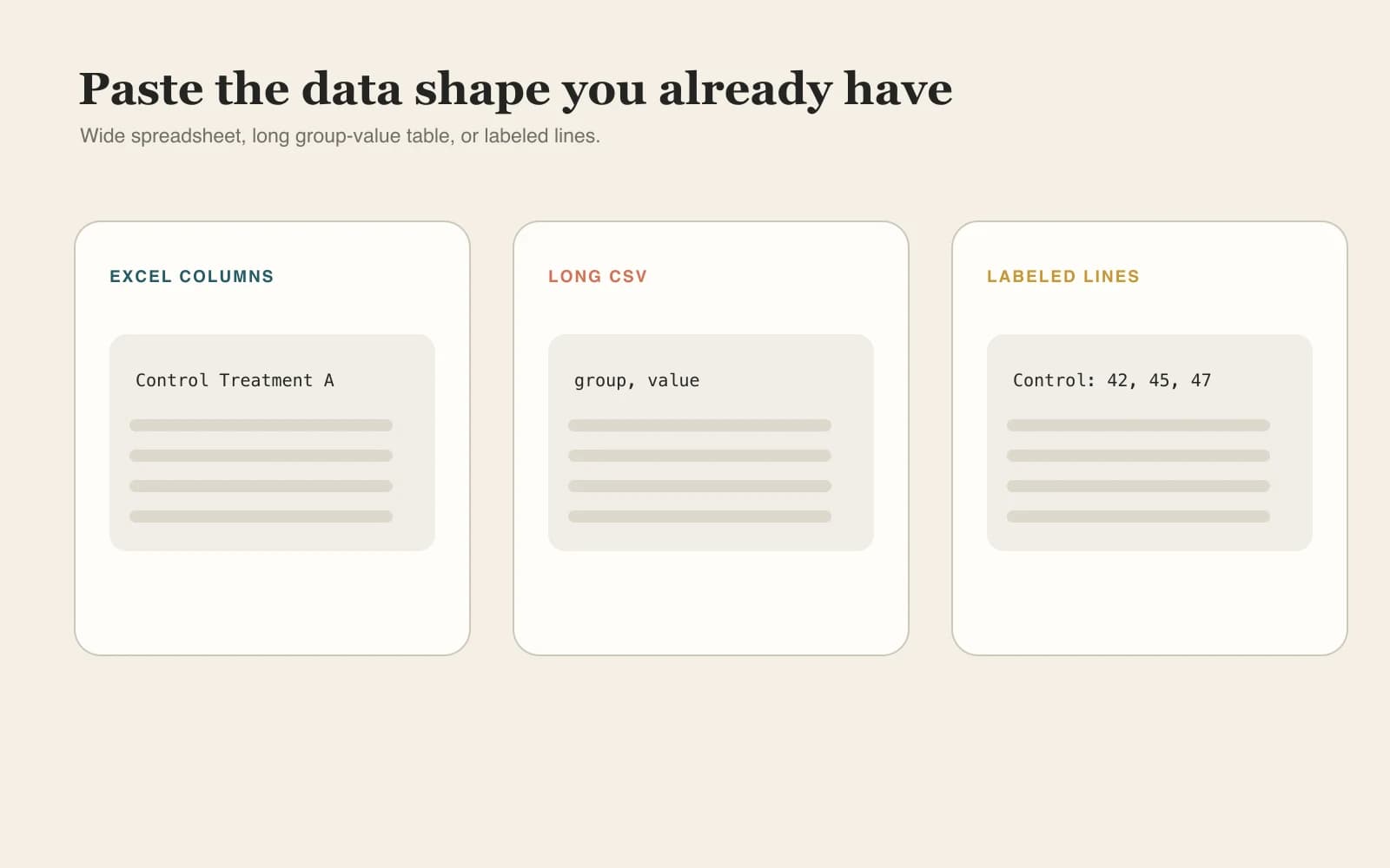
Paste from Excel or upload CSV

Use wide columns, a group/value table, a single numeric column, or labeled group lines. The parser ignores blanks and reports non-numeric cells.

Try Box Plot Maker
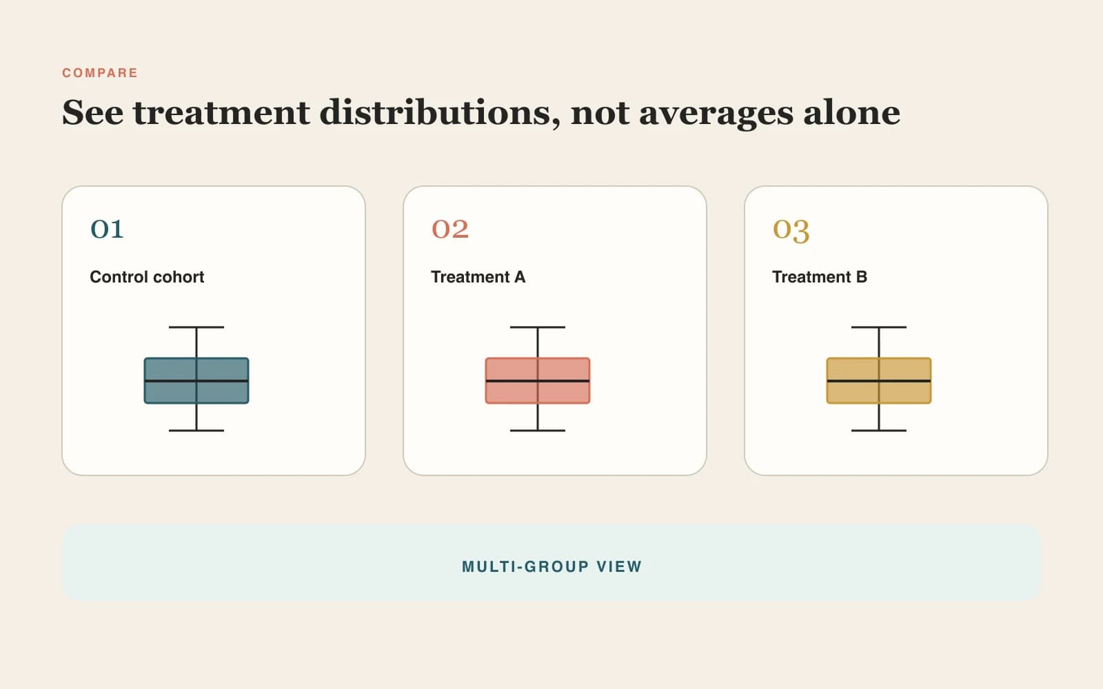
Box Plot Maker accepting wide Excel columns and group-value CSV data

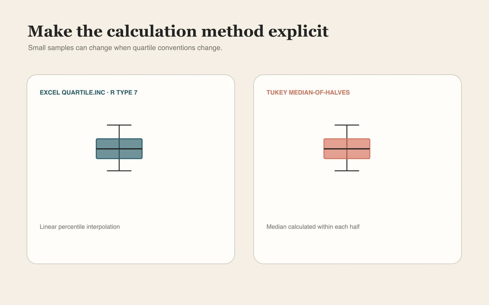
Choose quartile and whisker rules

Switch between Excel QUARTILE.INC / R type 7 and Tukey median-of-halves quartiles, plus 1.5×IQR or min–max whiskers.

Try Box Plot Maker
Box plot quartile methods compared with 1.5 IQR whisker rules

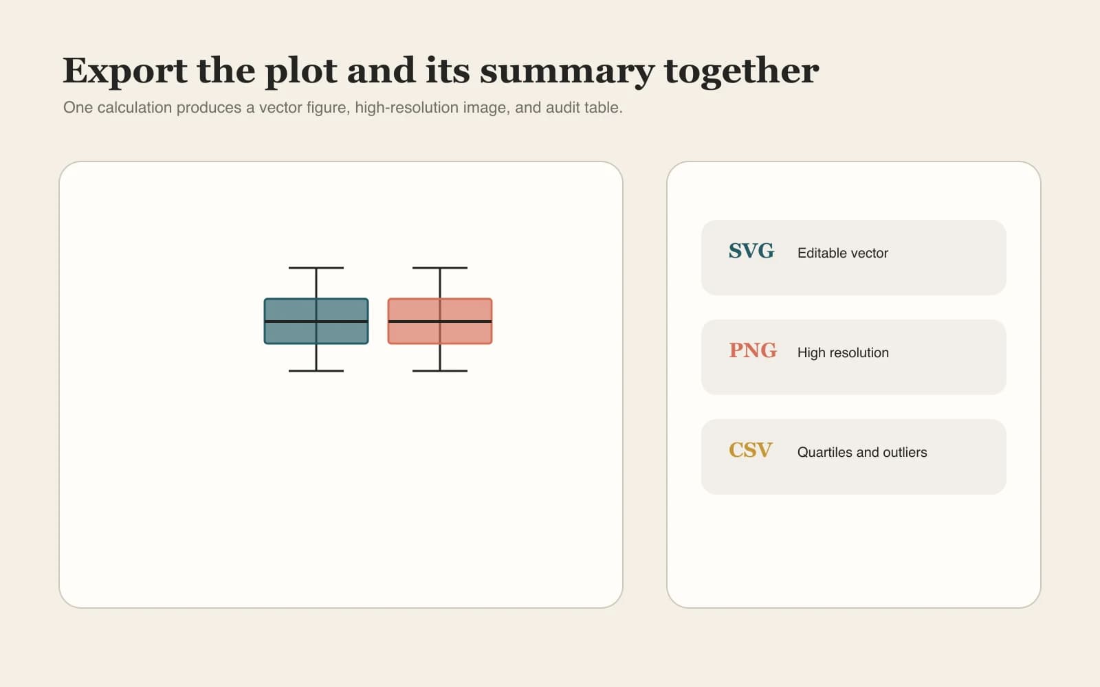
Export the plot and its statistics

Download editable SVG, high-resolution PNG, and a summary CSV containing n, quartiles, mean, range, IQR, and outlier count.

Try Box Plot Maker
Box plot generator export options for SVG PNG and summary CSV
Statistical guardrails

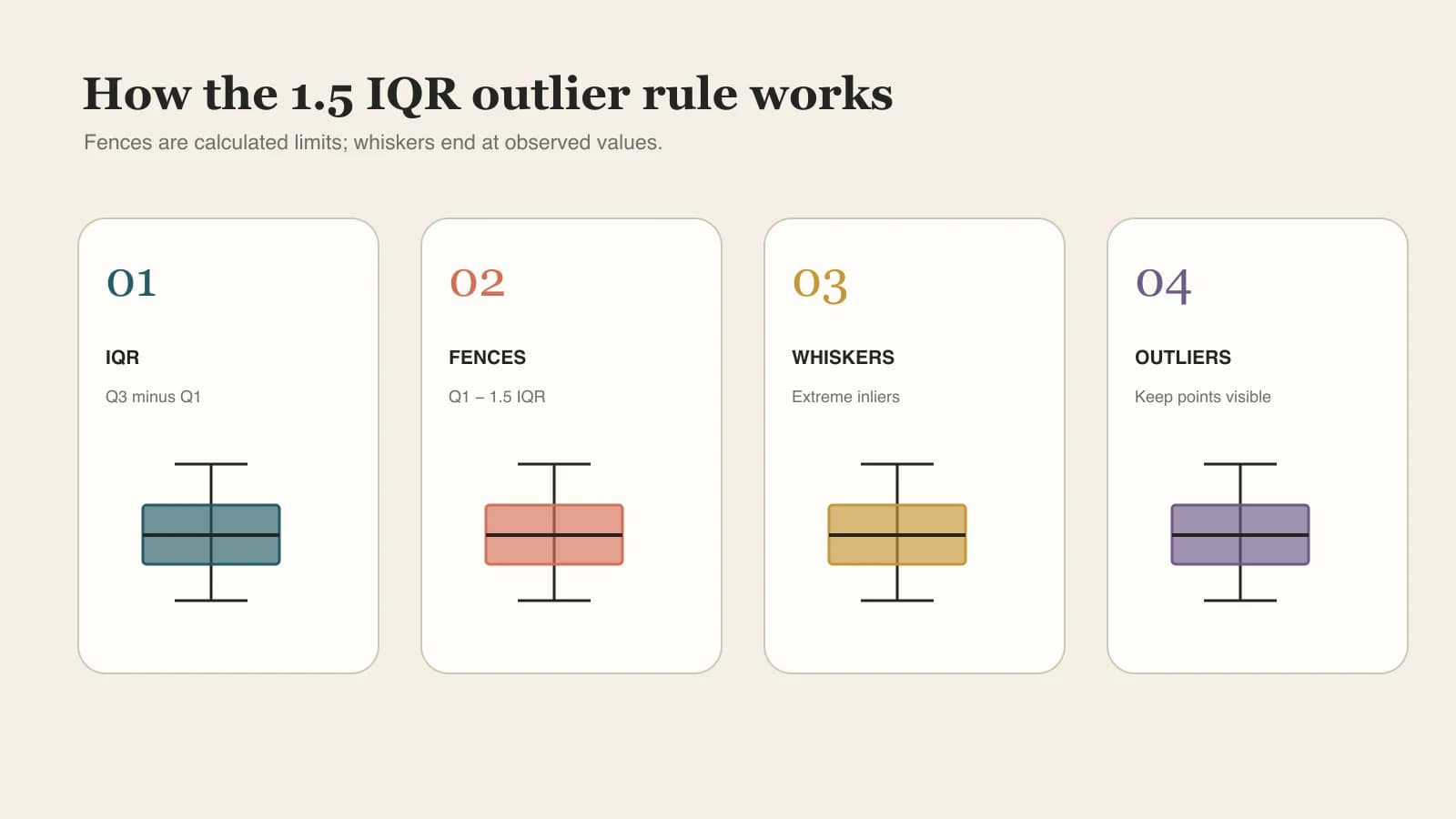
How the 1.5×IQR Outlier Rule Works

The tool exposes the decisions a polished chart can hide, so you can explain exactly how every box, whisker, and point was produced.

Calculate the IQR

Subtract Q1 from Q3 to measure the spread of the middle 50% of the data.

Set the fences

The lower fence is Q1−1.5×IQR; the upper fence is Q3+1.5×IQR.

Place the whiskers

Each whisker ends at the most extreme observed value still inside its fence.

Plot possible outliers

Observed values outside the fences stay visible as points; investigate them rather than deleting them automatically.

Box-and-whisker plot guide to Tukey 1.5 IQR outlier detection
Fences are calculated limits; whiskers end at observed inlier values, not at the fence itself.Method visible

Why use this box plot maker

Fast Enough for Exploration, Clear Enough for Review

Create a useful first figure without installing software or losing track of the calculation behind it.

No account required

No signup

Open the page and start from pasted values or an example dataset.

Data stays local

Local-first privacy

Values remain in the browser during parsing, calculation, preview, and download.

Less reformatting

Multiple input shapes

Use the same tool for a simple list, wide Excel table, or long group/value CSV.

Reproducible choices

Transparent quartiles

Method names explain why the result may differ from another calculator or software package.

Editable output

Publication-ready vector

SVG stays crisp in papers, slides, posters, and downstream figure editors.

Auditable results

Summary CSV

Keep the five-number summary, mean, IQR, and outlier count beside the image.

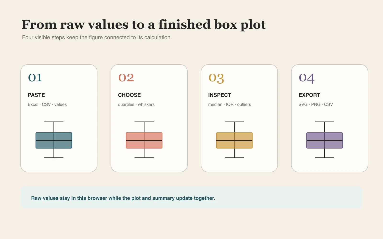
How to make a box plot

Create a Box Plot from Raw Data, Excel, or CSV

Four visible steps keep the source values, method, interpretation, and export connected.

01

Paste or upload raw values

Use one column per group, a group/value CSV, or labeled lines such as “Control: 12, 15, 18”.

02

Choose the calculation method

Select the quartile convention and whether whiskers use 1.5×IQR or the full minimum-to-maximum range.

03

Inspect boxes, outliers, and statistics

Review group sizes, Q1, median, Q3, means, whiskers, and any points outside the fences.

04

Export the plot and summary

Download SVG or PNG for the figure and CSV for the values used to review it.

Use Box Plot Maker
Box Plot Maker workflow from Excel or CSV data to an exported chart
The live plot and summary table always use the same values and selected method.

Continue the analysis workflow

Box Plot vs Histogram vs Violin Plot—and Related Tools

Use a box plot for compact group comparison, then choose a related research figure when the question changes.

Volcano plot with significant upregulated and downregulated features

Volcano Plot Generator

Visualize effect size against statistical significance in differential-expression results.

Forest plot with study confidence intervals and pooled effect diamond

Forest Plot Maker

Compare study effect estimates and confidence intervals, then summarize a pooled model.

Kaplan-Meier survival curves with censoring and number at risk

Kaplan-Meier Curve Maker

Analyze time-to-event data with censoring, confidence intervals, and a risk table.

Journal figure checker reviewing resolution and dimensions

Journal Figure Checker

Check dimensions, resolution, and file format before submitting the final figure.

Box Plot Maker FAQ

Box Plot Maker FAQ

How do I make a box plot from raw data?+

Paste one numeric list, put each group in its own Excel column, use a group/value CSV, or write labeled lines such as “Group A: 1, 2, 3”. The maker sorts each group, calculates its quartiles and whiskers, plots any detected outliers, and displays the summary table automatically.

Can I paste data directly from Excel or Google Sheets?+

Yes. Copy the header row and numeric cells from Excel or Google Sheets and paste them into the data field. Each column becomes a group. Blank cells are ignored, while non-numeric cells are counted and reported so you can check the source.

How are outliers calculated in a box plot?+

With the default Tukey rule, the IQR equals Q3 minus Q1. The lower and upper fences are Q1−1.5×IQR and Q3+1.5×IQR. Whiskers stop at the most extreme observed values inside those fences, and values beyond them are shown as possible outliers.

Why does my box plot differ from Excel, R, Python, or another calculator?+

Small datasets can produce different quartiles because software uses different interpolation or hinge conventions. Select Excel QUARTILE.INC / R type 7 to match the common inclusive interpolation, or Tukey median-of-halves when that convention matches your course or analysis plan before exporting.

What is the difference between a box plot and a box-and-whisker plot?+

They are two names for the same chart. The box runs from Q1 to Q3 with the median marked inside. The whiskers show either the selected non-outlying range or the full observed range, depending on the chosen rule. Individual points can show observations outside the whiskers.

Should I use 1.5×IQR whiskers or minimum-to-maximum whiskers?+

Use 1.5×IQR when you want the conventional Tukey display that separates possible outliers. Use minimum-to-maximum when your reporting standard explicitly requires whiskers to cover the full range. Always state the convention in a caption or methods note and keep it consistent across related figures.

Can I compare multiple groups in one box plot?+

Paste one column per group, repeat group names in a group/value table, or add one labeled line per group. The chart aligns every group on one numeric scale, while the summary table reports each sample size, quartiles, mean, whiskers, and outliers separately for a direct comparison.

Does this Box Plot Maker keep my data private?+

Values are parsed, calculated, and rendered in your browser rather than uploaded by this tool. You do not need an account to create or download a chart. Export options include editable SVG, high-resolution PNG, and a summary CSV so the statistical results can stay with the figure.

Online box-and-whisker plot generator

Create Your Box Plot in the Browser

Paste the raw values, choose a quartile and whisker method, inspect possible outliers, and export the figure with its summary.

Start Box Plot Maker