• Logo
    PaperBananaAI Academic Illustration Generator
Home
  • Home
  • Studio
  • Scientific Illustration Generator
  • Poster Maker
  • Diagram Maker
  • Figure Editor
  • Pricing
My Creations
  • My Creations
  • Invite Friends
LogoPaperBanana
HomePricingInvite Friends
LogoPaperBanana

PaperBanana - AI-powered academic illustration generator

support@paperbanana.me
All Tools

Tool directory

AI creation

  • Scientific Illustration
  • Graphical Abstract Maker
  • Scientific Poster Maker
  • Diagram Maker
  • Figure Editor

Diagrams & organizers

  • Conceptual Framework Generator
  • Graphic Organizer Maker
  • Frayer Model Maker
  • KWL Chart Maker
  • Cause and Effect Graphic Organizer
  • Compare and Contrast Graphic Organizer
  • Spider Diagram Maker
  • Plot Diagram Maker
  • Factor Tree Generator
  • Number Line Generator
  • Free Body Diagram Maker
  • PRISMA Flow Diagram Generator
  • Venn Diagram Maker
  • CONSORT Flow Diagram Generator

Data visualization

  • Scatter Plot Maker
  • Dot Plot Maker
  • Forest Plot Maker
  • Funnel Plot Maker
  • Kaplan-Meier Curve Maker
  • Box Plot Maker
  • Heatmap Generator
  • Volcano Plot Generator
  • Phylogenetic Tree Generator

Publishing tools

  • Free Journal Figure Checker
  • Free Image Format Converter
  • Free Tools
  • Prompts

© 2026 PaperBanana. All Rights Reserved.

Support

  • About
  • Pricing
  • Contact

Legal

  • Privacy Policy
  • Terms of Service
  • Acceptable Use
PricingContact
  1. Home
  2. Tools
  3. Free Scatter Plot Maker with Line of Best Fit
Free · No sign-up · Private by default

Free Scatter Plot Maker with Line of Best Fit

Use this Scatter Plot Maker to paste X-Y data, fit a regression line, inspect residual patterns and outlier impact, then export SVG, PNG, or analysis CSV—free, no sign-up.

Regression equation and R²Residual pattern diagnosticsMultiple data seriesSVG, PNG and analysis CSV

Scatter plot inputs

Create a Scatter Plot from X-Y Data

Use comma, tab, semicolon, or spaces between X and Y. Invalid rows stay visible in Data Health instead of being silently deleted.

Chart title
X-axis label
Y-axis label
Series 1
One pair per line: 1,528 valid pairs

Updates live

Line of Best Fit, Regression Equation, and R²

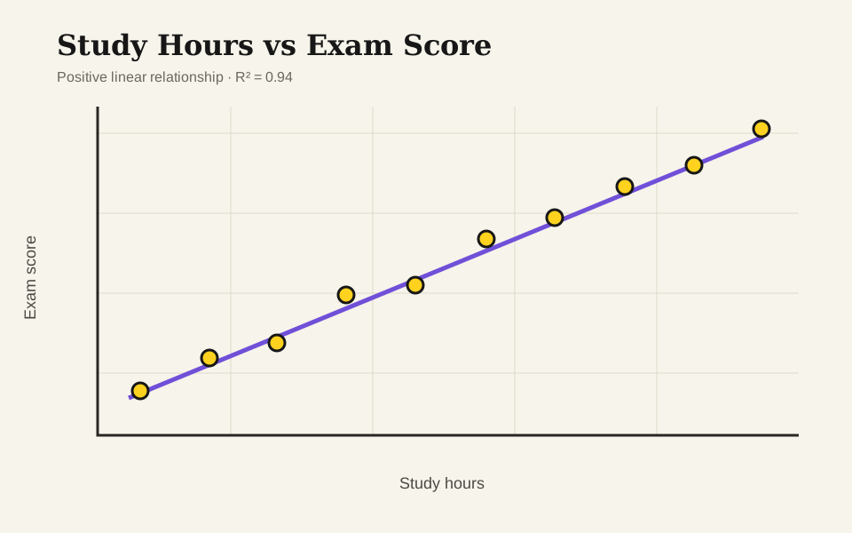
Study Hours vs Exam ScoreStudents0.42.54.56.58.648617487100Study hoursExam scoreStudents: y = 6.23x + 48.36 · R² = 0.987

Pairs (n)

8

Slope

6.226

Intercept

48.357

Pearson r

0.993

R²

0.987

Outlier Impact

No point currently crosses the candidate threshold. A point can still be influential even when it is not automatically flagged.

Everything is calculated in this browser. Your data is not uploaded or saved.

Scatter plot essentials

How to Read a Scatter Plot Beyond the Trendline

A scatter plot places one numeric variable on the horizontal axis and another on the vertical axis. Each observation becomes one point, making direction, strength, shape, clusters, and unusual observations visible before a model is fitted.

The line of best fit summarizes a linear pattern, while the regression equation describes its slope and intercept. R² reports how much of the variation in Y is explained by that fitted line—not whether one variable causes the other or whether the model is appropriate.

01

Direction

Points can rise, fall, or show no consistent direction as X changes.

02

Strength

Tighter clustering around a line usually means a stronger linear relationship.

03

Shape

A curve can be a strong relationship even when a straight-line R² is weak.

04

Unusual points

Outliers and high-leverage points can change the slope and the conclusion.

Scatter Plot Examples: Linear, Grouped, and Nonlinear Data

Load any example into the generator, inspect the fit, and replace the numbers with your own paired data.

Built for real analysis

Use a Scatter Plot Maker for Classes, Labs, and Reports

Use the same fast workflow for homework, experiments, methods comparison, and decision-ready reports.

Student using Scatter Plot Maker to analyze experiment data on a laptop

Students complete scatter plot assignments

Paste the data, add the line of best fit, read the equation and R², then export a clean figure without hunting through spreadsheet menus.

Laboratory researcher reviewing regression residuals and paired measurements

Researchers validate regression before reporting

Check source rows, sample size, residual behavior, and outlier impact before placing the figure in a paper, lab note, or presentation.

Teacher explaining how an outlier changes a scatter plot trendline

Teachers demonstrate outlier influence

Load an example, highlight a candidate outlier, and show how one observation can change the slope and R² without deleting it automatically.

Information gain

Check Residuals, Data Quality, and Outlier Impact

The generator does not stop after drawing dots. It checks the input, tests what the straight line leaves unexplained, and shows how stable the conclusion is.

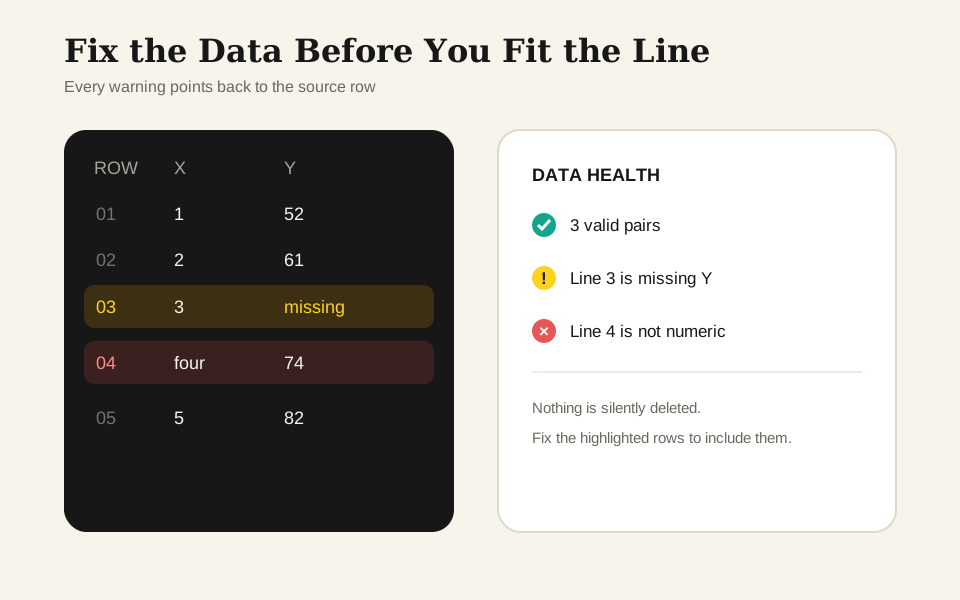
Fix invalid X-Y rows without losing valid points

Missing pairs, nonnumeric values, extra values, duplicates, and constant X data stay visible. Every warning includes the series and line number so you can repair the input instead of guessing what disappeared.

Open Scatter Plot Maker
Data health panel showing valid pairs and row-level input warnings

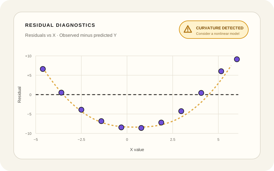
Check whether a straight line fits the data

A live residual plot shows the error left behind by the best-fit line. The pattern check flags strong curvature or changing spread, helping you notice when a linear trendline may hide important structure.

Open Scatter Plot Maker
Residual diagnostics plot showing a curved pattern around the zero line

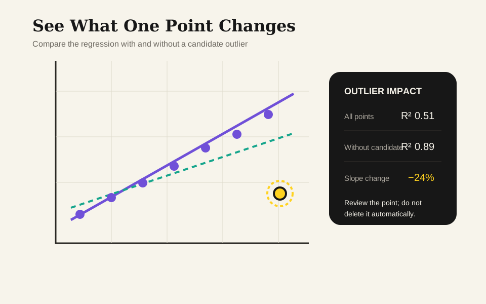
Measure how an outlier changes the trend

A candidate point is never deleted automatically. Compare R² and slope with and without it, then return to the original measurement before deciding whether the observation belongs in the analysis.

Open Scatter Plot Maker
Outlier impact comparison showing changes in slope and R squared

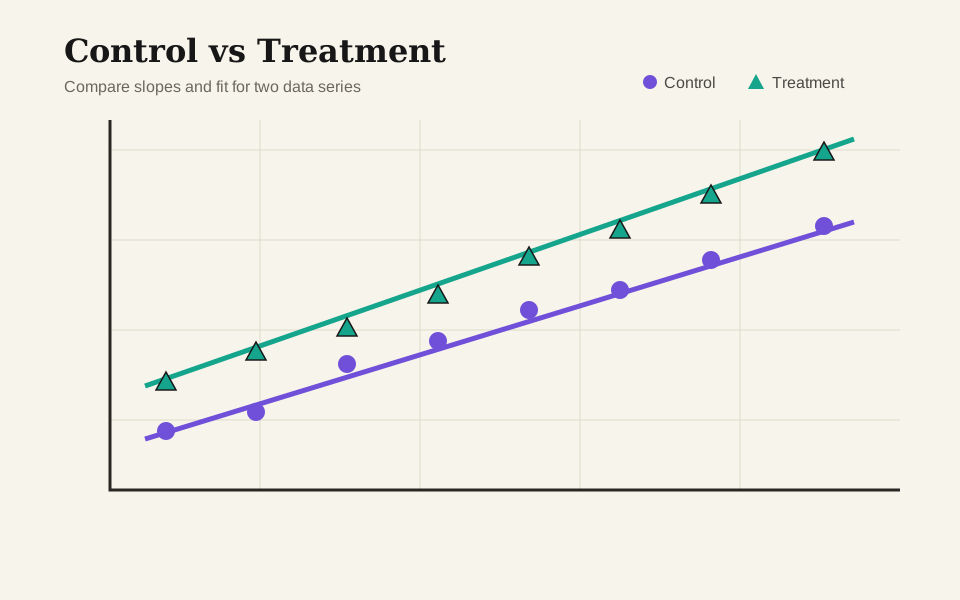
Compare multiple data series on one scatter plot

Plot control, treatment, cohorts, instruments, or years on one coordinate system. Each group keeps a distinct color, marker, regression line, sample size, and statistics.

Open Scatter Plot Maker
Grouped scatter plot with control and treatment regression lines
Interpret with care

How to Read Correlation Without Overreading It

Use the regression numbers as evidence about the plotted sample—not as proof of causation, data quality, or the right model shape.

R² measures fit to this linear model

It describes explained variation in the plotted sample. It is not accuracy and does not establish cause and effect.

Shape comes before the straight line

Curves, clusters, funnels, and gaps can make a single linear trendline inappropriate even when a number is available.

Outliers need investigation, not automatic deletion

A flagged point can be a measurement error, a rare valid case, or the observation that reveals the real mechanism.

Units and sampling still matter

A polished chart cannot repair biased sampling, mixed units, nonindependent observations, or an unsuitable experiment.

Scatter plot and outlier impact table comparing regression results
The same data can support a different fitted slope when one influential point is removed.Check sensitivity

Built for usable output

Why use this online scatter plot maker?

Move from raw pairs to a checked, explained, and exportable chart without moving between separate apps.

No sign-up

Start without an account

Open the page, replace the example, and export the result without registration or a watermark.

Private by default

Keep the data in this browser

Parsing, regression, outlier checks, and image export run locally instead of uploading your values.

One source of truth

Keep the chart and regression results synchronized

The plot, equation, R², residual diagnostics, outlier comparison, and written summary all read from the same paired data.

Analysis-ready

Export the chart and its analysis data

Use SVG or PNG for the figure, then download a CSV containing every valid pair, fitted value, residual, studentized residual, and outlier flag.

Row-level checks

Fix bad rows without starting over

Line-level warnings reveal missing and nonnumeric values while leaving the rest of the valid points visible.

Interpretation guardrail

Explain the result without overclaiming

Copy a concise regression summary that includes a correlation-does-not-imply-causation reminder.

Three-step workflow

How to Make a Scatter Plot Online

Begin with the raw paired observations, inspect the pattern, and export only after checking the fit.

01

Paste X-Y Data

Copy two columns from Excel or Google Sheets, or enter one comma-, tab-, semicolon-, or space-separated pair per line.

02

Check the Regression and Residual Plot

Name the axes, add series, inspect Data Health, and compare the line of best fit, Pearson r, R², residual pattern, and any candidate outlier.

03

Download SVG, PNG, or Analysis CSV

Download an editable SVG or high-resolution PNG, copy the synchronized regression summary, or export an analysis CSV with predictions and residuals.

Use Scatter Plot Maker Now
Completed scatter plot with line of best fit in PaperBanana Scatter Plot Maker
A chart title, named axes, visible observations, and a transparent regression summary make the result easier to review.

Continue the analysis

Compare Scatter Plots with Other Statistical Charts

Choose the chart or organizer that matches the next question in your data.

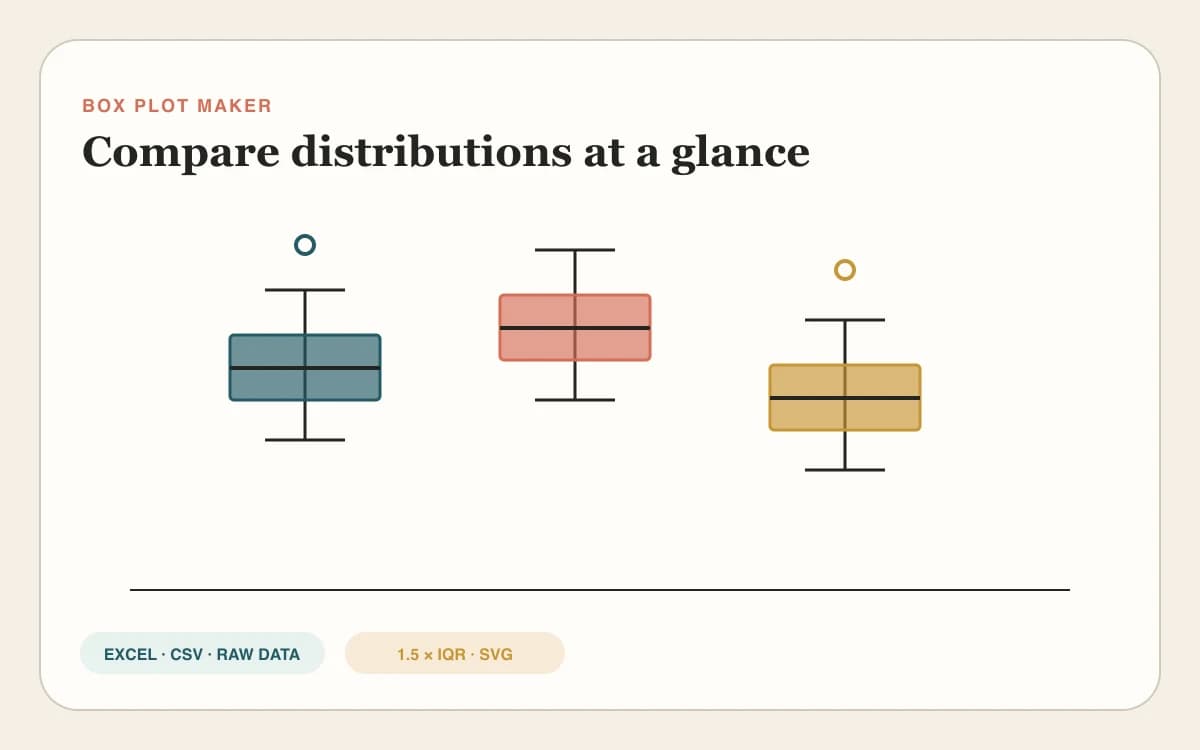
Grouped box and whisker plots

Box Plot Maker

Compare medians, quartiles, whiskers, means, and 1.5×IQR outliers across groups.

Clustered heatmap with dendrograms

Heatmap Generator

Turn a numeric matrix into a normalized, clustered heatmap with optional dendrograms.

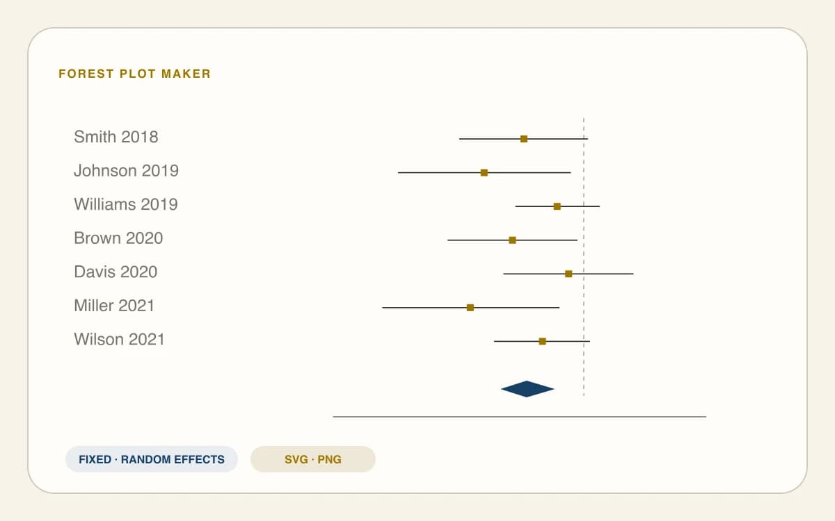
Forest plot with study confidence intervals

Forest Plot Maker

Compare study effects and confidence intervals with a pooled meta-analysis estimate.

Three-set Venn diagram with labeled overlaps

Venn Diagram Maker

Calculate and visualize exact overlaps across two to six sets.

Scatter plot FAQ

Scatter Plot Maker FAQ

How do I make a scatter plot from X and Y values?+

Place each observation on its own line with X first and Y second, separated by a comma, tab, semicolon, or space. Name both axes and confirm that every row represents one paired observation. The maker plots valid pairs immediately and lists rows that need correction.

How do I add a line of best fit to a scatter plot?+

Keep the Line of best fit switch on. The tool calculates an ordinary least-squares linear regression with an intercept, then draws the fitted line across the visible X range. It also reports the slope, intercept, Pearson correlation, R², and sample size from the same valid pairs.

What do the regression equation and R² mean?+

The equation predicts Y from X using the fitted slope and intercept. R² describes the share of Y variation explained by that linear fit in this sample. It does not measure general accuracy, prove that the relationship is causal, or show that a straight line is the right model.

Can I plot two or more data sets on the same scatter plot?+

Yes. Add up to four series and give each a name, color, marker, and its own X,Y pairs. The chart keeps the groups on the same axes while calculating a separate line and statistics for each series, which is useful for control, treatment, cohort, or instrument comparisons.

How do outliers affect the line of best fit?+

An unusual point can pull the slope, intercept, correlation, and R² toward itself, especially when it has an extreme X value. Outlier Impact compares the fit with and without a candidate point. Treat that comparison as a diagnostic and inspect the original measurement before excluding anything.

When should I not use a linear trendline?+

Avoid interpreting a straight line when the points form a clear curve, separate clusters, a funnel, repeated bands, or another structured pattern. Residual Diagnostics plots the remaining error against X and flags strong curvature or changing spread as a practical warning that the linear model may be incomplete.

What does the residual plot show?+

A residual is the observed Y value minus the Y value predicted by the line. A loose, patternless cloud around zero supports the linear fit; visible curves or changing spread suggest the line is leaving structure unexplained. The automatic message is a screening aid rather than a formal statistical test.

How do I make a scatter plot from Excel or Google Sheets data?+

Copy two adjacent numeric columns and paste them into the X,Y pairs box; tab-separated spreadsheet rows are recognized automatically. Comma-, semicolon-, and space-separated pairs also work. Data Health identifies incomplete or nonnumeric rows, while parsing and regression calculations stay inside your browser.

Plot, check, explain

Create a Scatter Plot with Checked Regression Results

Paste the data once. Keep the chart, regression results, residual diagnostics, outlier check, and analysis CSV synchronized from the first point to the final export.

Use Scatter Plot Maker Now