• Logo
    PaperBananaAI Academic Illustration Generator
Home
  • Home
  • Studio
  • Scientific Illustration Generator
  • Poster Maker
  • Diagram Maker
  • Figure Editor
  • Pricing
My Creations
  • My Creations
  • Invite Friends
LogoPaperBanana
HomePricingInvite Friends
LogoPaperBanana

PaperBanana - AI-powered academic illustration generator

support@paperbanana.me

AI Tools

  • All Tools
  • Text to Illustration
  • Scientific Illustration Generator
  • Figure Editor
  • Diagram Maker
  • Poster Maker

Support

  • About
  • Pricing
  • Contact

Legal

  • Privacy Policy
  • Terms of Service
  • Acceptable Use

© 2026 PaperBanana. All Rights Reserved.

PricingContact
Meta-analysis · browser-based · free export

Funnel Plot Maker for Meta-Analysis

Paste study effect sizes and precision data to create a publication-ready funnel plot without R. Inspect small-study effects with 95% or 99% pseudo-confidence limits and optional significance contours. Your data stays in your browser.

Paste Excel, CSV, or TSV dataMap SE, variance, or 95% CIConfidence and significance contoursExport SVG, PNG, or JSON

Study data and plot settings

Paste one row per study. Precision may be SE, Variance, or a 95% CI.

balanced-effects.tsv

All rows are valid and mapped.

Your table is processed locally in this browser.

Live funnel plot

11
studies
0.19
pooled effect
0.00e+0%
I²
0.00e+0
τ²
Funnel plot of standardized mean differencesStudy effect estimates plotted horizontally against standard error on a reversed vertical axis.Funnel plot of standardized mean differencesSMD · Fixed effectAnders 2015: 0.18, SE 0.07Bennett 2016: 0.21, SE 0.09Costa 2017: 0.15, SE 0.11Dubois 2018: 0.28, SE 0.13Ellis 2019: 0.08, SE 0.15Foster 2020: 0.34, SE 0.17Garcia 2021: 0.02, SE 0.19Huang 2022: 0.40, SE 0.22Ito 2023: -0.05, SE 0.25Jones 2024: 0.48, SE 0.28Khan 2025: -0.12, SE 0.32-0.92-0.370.190.741.300.00e+00.090.190.280.37Effect estimate (SMD)Standard errorPooled effect

Asymmetry is not proof of publication bias. Interpret this plot with heterogeneity, study design, and sensitivity analyses.

Funnel plot basics

What is a funnel plot in meta-analysis?

A funnel plot is a scatter plot used in meta-analysis to compare each study's effect estimate with a measure of precision, commonly its standard error. Larger, more precise studies appear near the top, while smaller studies spread more widely toward the bottom.

When sampling variation is the main source of scatter, study points often form a roughly symmetrical inverted funnel around the pooled effect. Visible asymmetry is commonly investigated as a small-study effect, but it can also arise from heterogeneity, outcome selection, methodological differences, or chance.

This Funnel Plot Maker calculates inverse-variance fixed or DerSimonian–Laird random-effects summaries. It can derive precision from standard error, variance, or a 95% confidence interval and keeps ratio measures on the log scale during analysis.

01

Effect estimate

One MD, SMD, OR, RR, HR, or generic estimate per study.

02

Precision

Standard error, variance, or lower and upper 95% limits.

03

Reversed SE axis

More precise studies appear at the top of the funnel.

04

Cautious interpretation

Asymmetry prompts investigation; it does not prove bias.

Funnel Plot Examples for Meta-Analysis

Load any example into the generator to inspect its data, model, limits, and contours.

Built for evidence synthesis

Use a Funnel Plot in Systematic Reviews and Manuscripts

Use the same plot for exploratory checks, team review, and manuscript preparation.

Systematic review researcher examining a funnel plot on a monitor

Systematic Review Authors

Turn an extracted effect-size table into a funnel plot without rebuilding an R script or spreadsheet chart.

Evidence synthesis team reviewing a printed meta-analysis funnel plot

Evidence Synthesis Teams

Compare fixed and random-effects centers and discuss plausible causes of asymmetry with collaborators.

Researcher preparing a contour-enhanced funnel plot for journal revision

Journal Revisions

Add confidence or significance contours and export an editable vector figure for a reviewer response.

Purpose-built controls

Create a Funnel Plot From Common Meta-Analysis Data

The generator handles common evidence tables and exposes the choices needed for transparent interpretation.

Flexible Precision Mapping

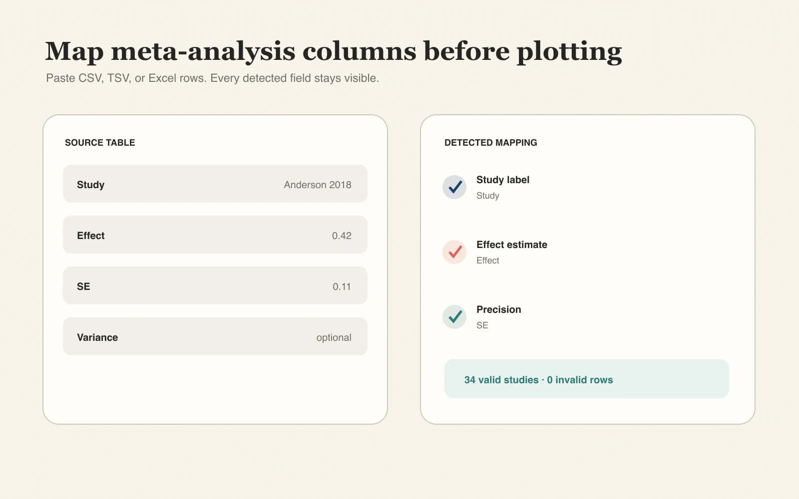
Use Study + Effect with SE, Variance, or Lower CI + Upper CI. Recognized headers are mapped automatically and invalid rows are reported.

Try the Funnel Plot Maker
Data mapping workflow from study effect and precision columns into a funnel plot

Confidence and Significance Contours

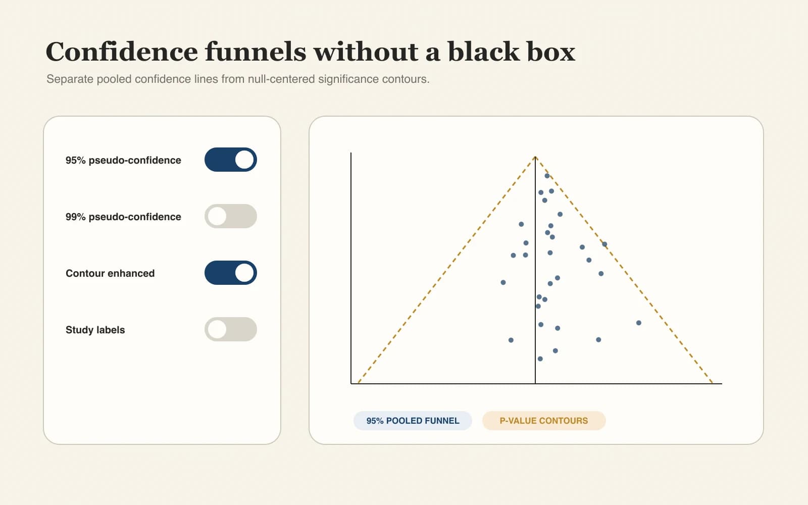
Switch 95% and 99% pseudo-confidence limits on or add two-sided p = 0.05 and p = 0.01 regions around the no-effect value.

Try the Funnel Plot Maker
Funnel plot controls for confidence limits and significance contours

Reproducible, Editable Exports

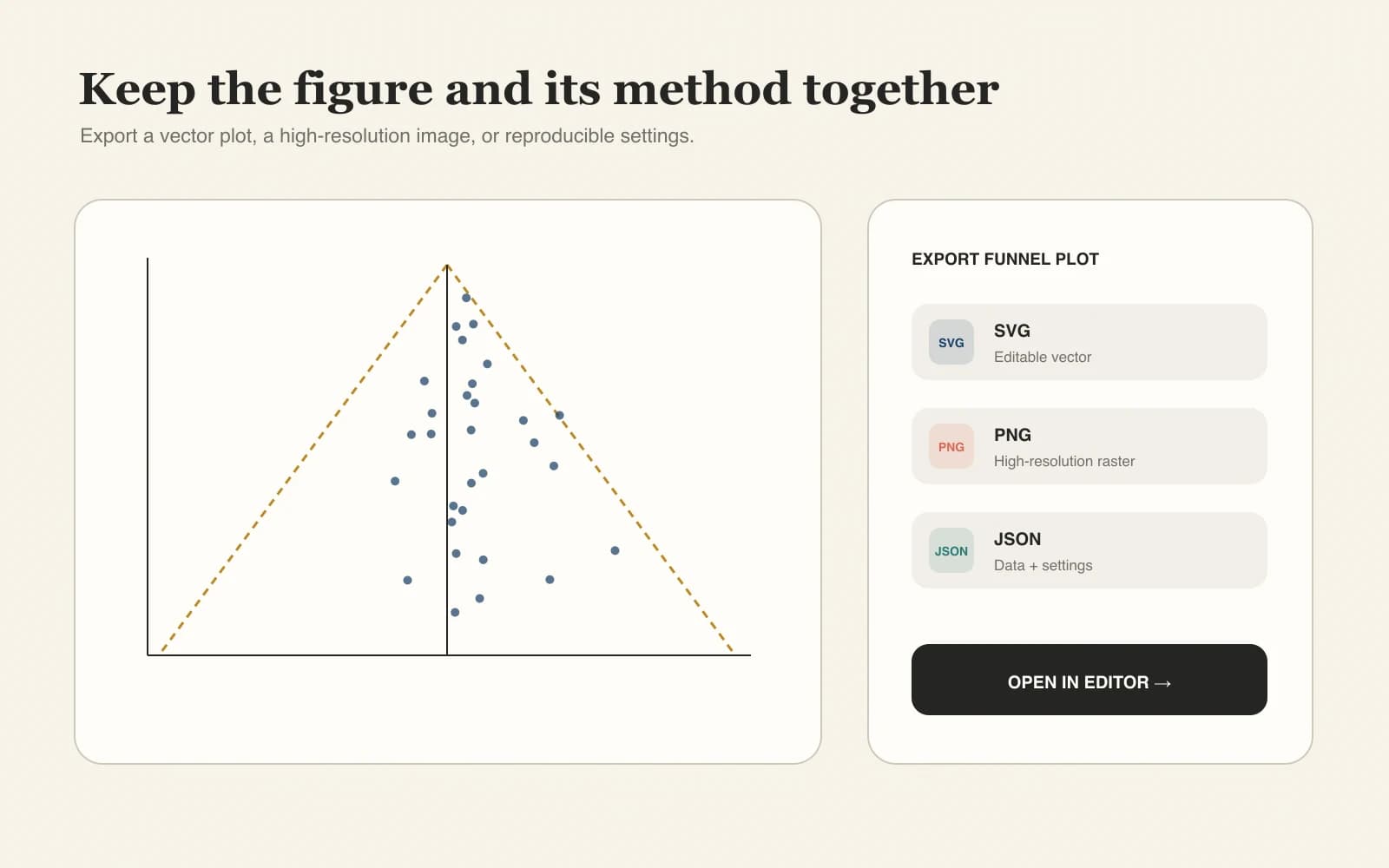
Download SVG or PNG figures and a JSON record containing the source data, settings, and calculated summary statistics.

Try the Funnel Plot Maker
Funnel plot export workflow showing SVG PNG and JSON outputs
Interpretation guardrails

Funnel Plot Asymmetry Needs Context

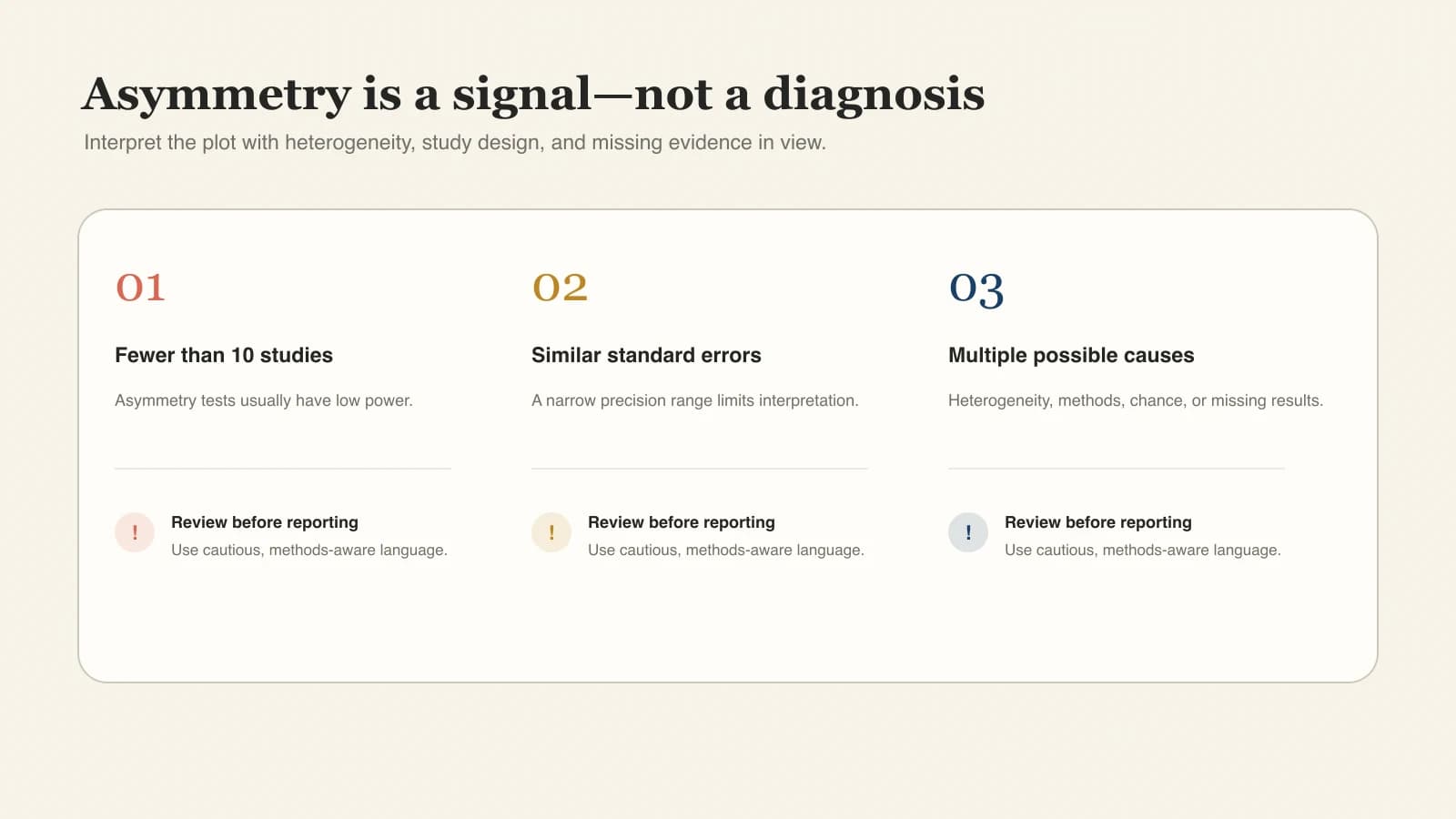
A funnel plot is an exploratory diagnostic. Its shape should be interpreted alongside study design, heterogeneity, selective reporting, and prespecified analyses.

Avoid a one-cause conclusion

Publication bias is only one possible cause of asymmetry. Genuine effect differences, poorer methods in small studies, outcome selection, and chance can create similar patterns.

Treat small sets cautiously

With fewer than about ten studies, visual patterns and formal asymmetry tests usually have limited power and can be misleading.

Report what you plotted

State the effect measure, precision axis, meta-analysis model, contour type, and any transformations used.

Interpretation checklist beside a meta-analysis funnel plot
The generator warns when fewer than ten valid studies are available and never labels a plot as proof of publication bias.Scientific caution

Transparent statistical method

How This Funnel Plot Maker Calculates the Figure

The chart uses standard meta-analysis conventions and keeps every transformation visible. The calculations run locally in your browser.

01

Precision input

Standard errors are used directly, calculated as the square root of variance, or derived from two-sided 95% confidence limits with z = 1.95996.

02

Effect scale

Mean differences and standardized mean differences use a linear scale. Odds ratios, risk ratios, and hazard ratios are calculated on the log scale and displayed on the original ratio scale.

03

Pooled center and limits

The center is an inverse-variance fixed-effect or DerSimonian-Laird random-effects estimate. Pseudo-confidence limits use center ± z × standard error.

Method references

Cochrane Handbook, Chapter 13Guidance on funnel-plot axes, ratio measures, asymmetry tests, and interpretation limits.metafor funnel documentationReference behavior for standard-error funnels, confidence levels, labels, and transformations.

Methodology last reviewed September 5, 2026.

Why use this tool

Create a Funnel Plot Without R or Manual Charting

Move from an extracted study table to an editable figure while retaining statistical and reporting context.

Browser workflow

No coding required

Create a statistically grounded figure without writing R, Python, or spreadsheet formulas.

Flexible input

No data reformatting loop

Paste common SE, variance, or confidence-interval tables directly from your extraction sheet.

Two models

Model-aware center line

Compare inverse-variance fixed and DerSimonian–Laird random-effects summaries.

Correct scale

Ratio measures handled correctly

OR, RR, and HR values are transformed to the log scale for calculations.

SVG + PNG

Publication-ready vector output

Export scalable SVG for final editing or PNG for documents and presentations.

Local processing

Private by default

Generation and export happen locally in your browser; pasted data is not uploaded.

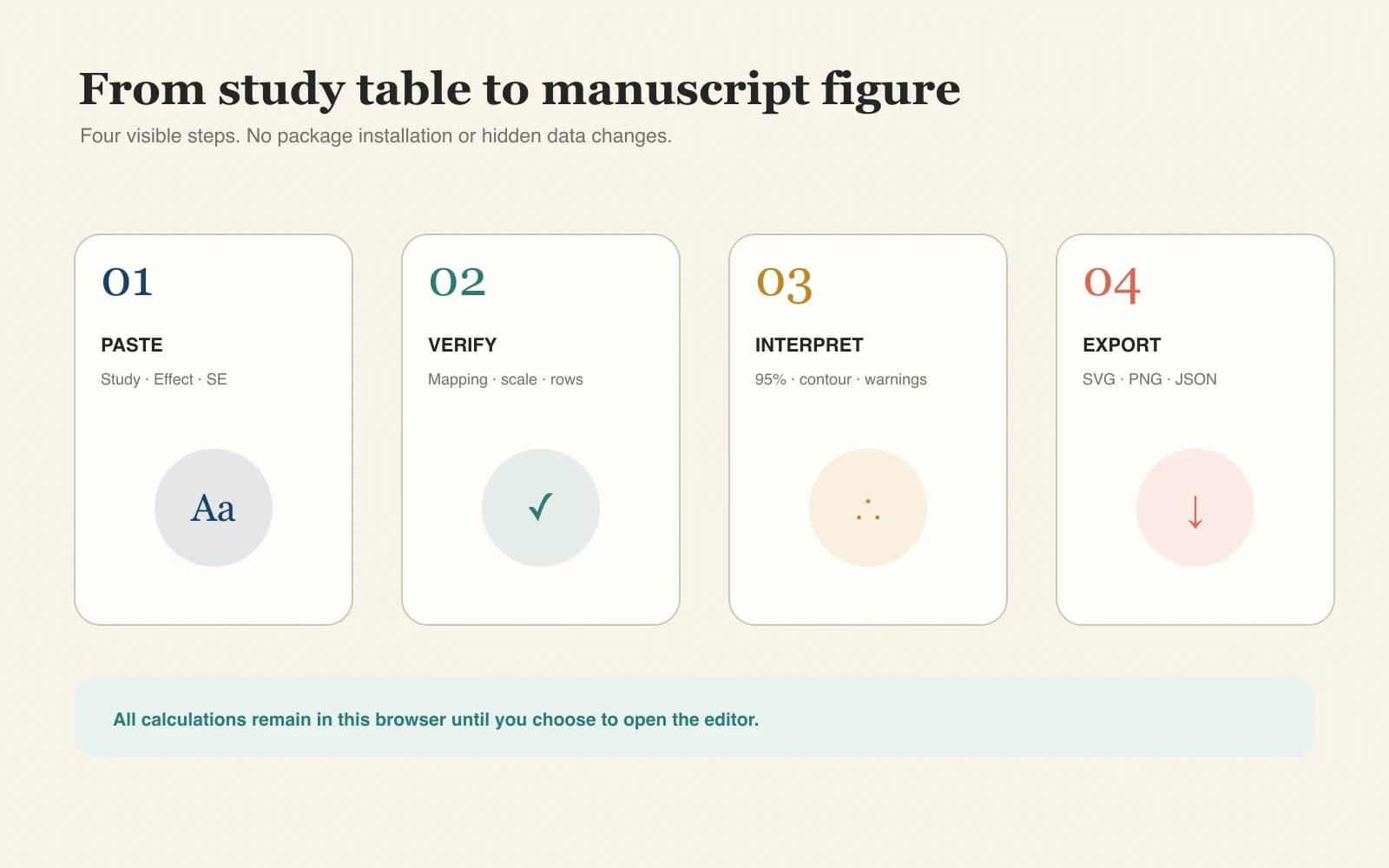
Four-step workflow

How to Make a Funnel Plot

Use a clean study-level table, confirm the analytical scale, then export the result with its settings.

01

Paste or upload the study table

Provide Study and Effect columns plus SE, Variance, or Lower CI and Upper CI. CSV, TSV, and copied Excel cells are supported.

02

Select the effect measure and model

Choose MD, SMD, OR, RR, HR, or Generic, then select a fixed or random-effects pooled center.

03

Choose limits and contours

Show 95% or 99% pseudo-confidence limits, significance contours, and study labels when they help interpretation.

04

Review the caveat and export

Check invalid rows, study count, I², and τ². Download SVG, PNG, or JSON and document the settings in your methods.

Use Funnel Plot Maker
Four-step workflow for creating and exporting a meta-analysis funnel plot
Your input, analysis settings, and calculated results stay together in the JSON export for reproducibility.

Continue the review workflow

Related Systematic Review Tools

Summarize effect estimates, document study selection, and prepare figures for publication.

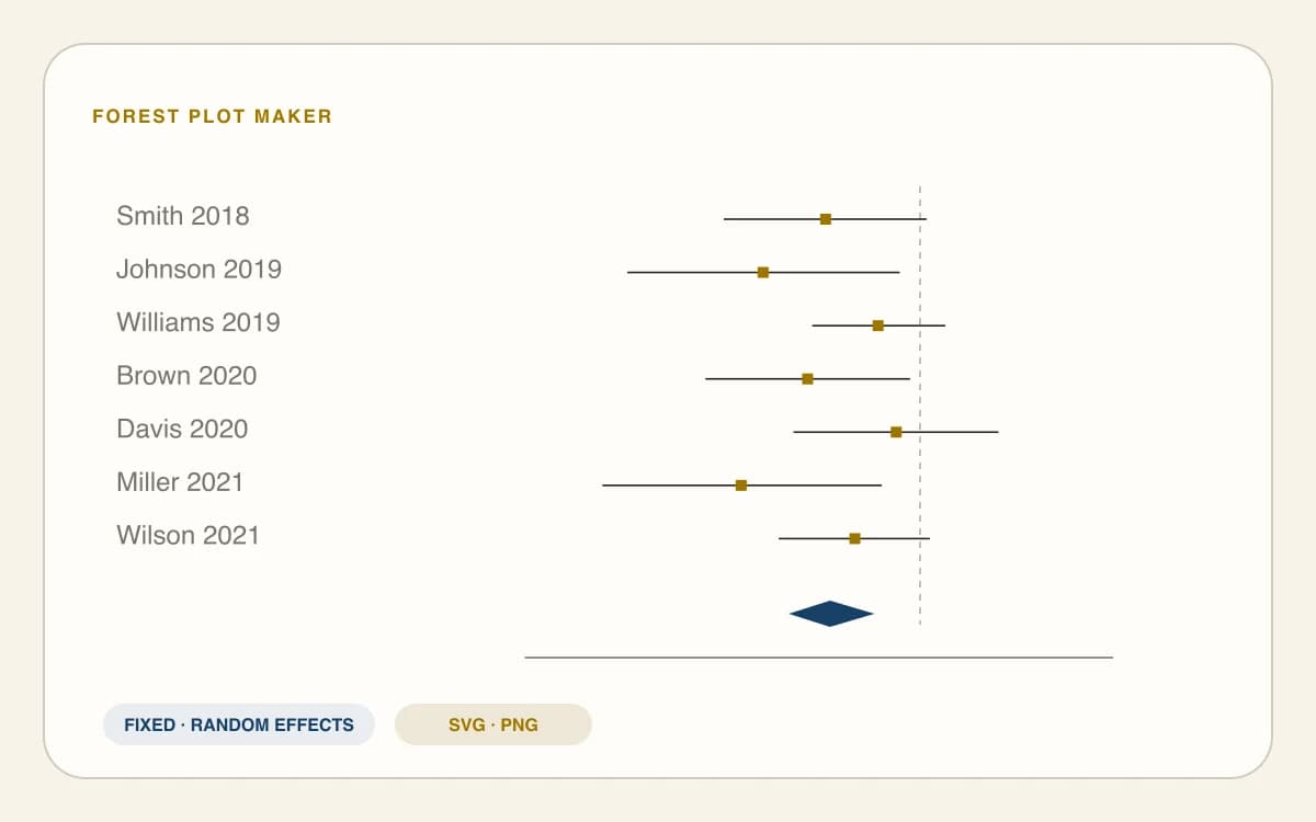
Forest plot maker with study confidence intervals

Forest Plot Maker

Display individual study estimates, confidence intervals, weights, and a pooled-effect diamond.

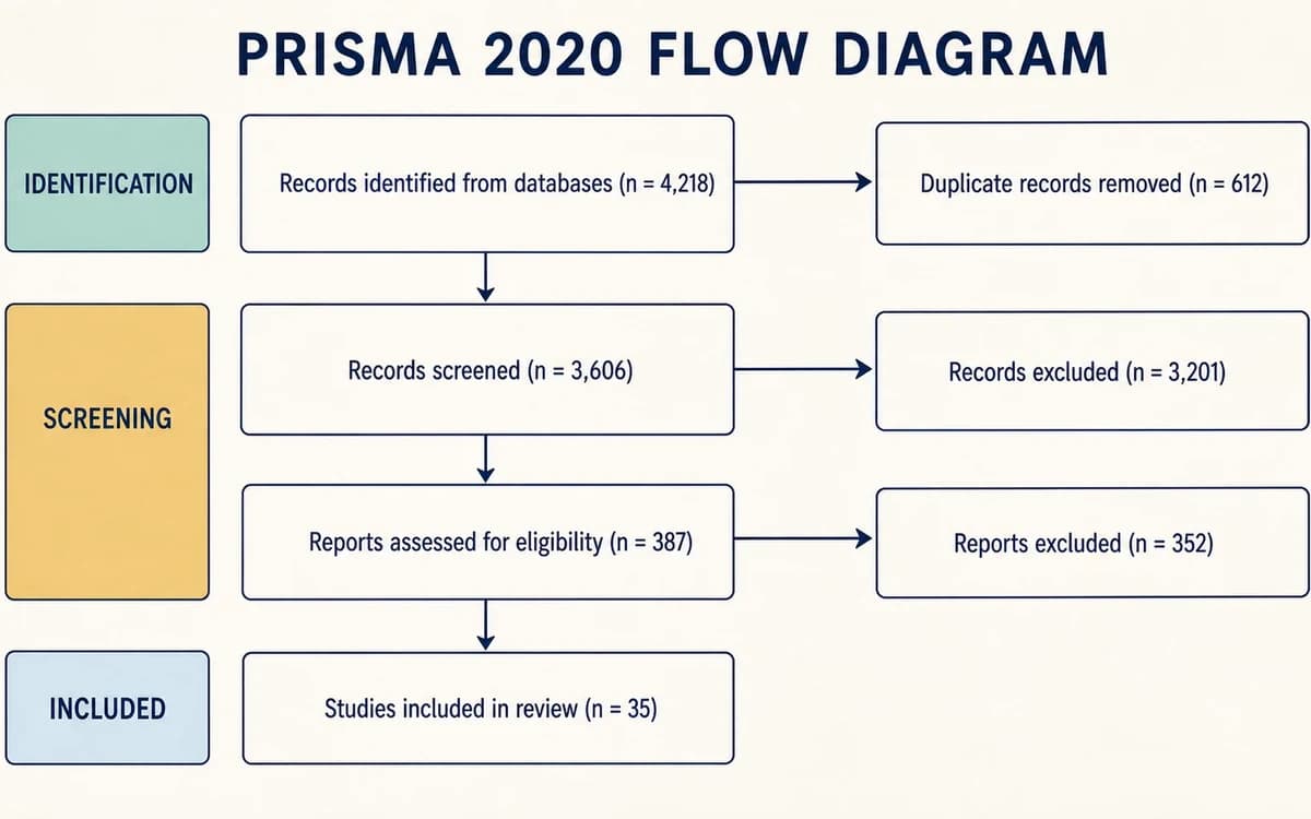
PRISMA flow diagram for systematic review selection

PRISMA Flow Diagram Generator

Document identification, screening, eligibility, and inclusion using PRISMA 2020.

Journal figure checker reviewing a funnel plot export

Journal Figure Checker

Check dimensions, resolution, file format, and typography before submission.

Scientific figure editor refining a funnel plot

Scientific Figure Editor

Refine labels, annotations, and layout in the exported vector figure.

Funnel Plot Maker FAQ

Funnel Plot FAQ: Data, Asymmetry, and Publication Bias

What data columns do I need for a funnel plot?+

You need a Study column, an Effect column, and one precision input: SE, Variance, or both Lower CI and Upper CI. Select the matching effect measure so OR, RR, and HR data are analyzed on the logarithmic scale.

How do I make a funnel plot from Excel without R?+

Copy your study table from Excel and paste it into the generator, or upload a CSV or TSV file. The chart updates in your browser, so no R code or package installation is required before exporting SVG or PNG.

How do I interpret funnel plot asymmetry?+

Treat asymmetry as evidence that effect estimates may vary with study precision, not as a diagnosis. Check heterogeneity, study methods, outcome selection, reporting practices, and chance before deciding which explanation is plausible.

Can funnel plot asymmetry prove publication bias?+

No. Publication bias is one possible cause, but true effect differences, weaker methods in small studies, selective outcomes, and random variation can produce the same pattern. A contour-enhanced funnel plot adds context but still does not prove that studies are missing.

How many studies are needed for a funnel plot?+

You can draw a funnel plot with fewer studies, but sparse patterns are difficult to interpret. Formal asymmetry tests usually have low power below about 10 studies. The generator therefore displays a caution when fewer than 10 valid studies are plotted.

Should standard error or sample size be on the y-axis?+

Use standard error on the vertical axis for this meta-analysis funnel plot. The scale is reversed, so more precise studies appear near the top. Sample size can be used in other funnel-plot designs, but it is not interchangeable with standard error.

What is a contour-enhanced funnel plot?+

A contour-enhanced funnel plot shades two-sided significance regions around the no-effect value. The regions help you see whether gaps fall mainly in nonsignificant areas or elsewhere, but the visual pattern remains exploratory and must be interpreted with the study context.

What is the difference between a funnel plot and a forest plot?+

A forest plot shows each study estimate and confidence interval, often with a pooled result. A funnel plot places estimates against precision to inspect small-study patterns. Use both: the forest plot for effect synthesis and the funnel plot for exploratory asymmetry assessment.

From study table to publication figure

Create Your Meta-Analysis Funnel Plot

Paste effect estimates, check the analytical settings, and export an editable figure in minutes.

Use Funnel Plot Maker