• Logo
    PaperBananaAI Academic Illustration Generator
Home
  • Home
  • Studio
  • Scientific Illustration Generator
  • Poster Maker
  • Diagram Maker
  • Figure Editor
  • Pricing
My Creations
  • My Creations
  • Invite Friends
LogoPaperBanana
HomePricingInvite Friends
LogoPaperBanana

PaperBanana - AI-powered academic illustration generator

support@paperbanana.me

AI Tools

  • All Tools
  • Text to Illustration
  • Scientific Illustration Generator
  • Figure Editor
  • Diagram Maker
  • Poster Maker

Support

  • About
  • Pricing
  • Contact

Legal

  • Privacy Policy
  • Terms of Service
  • Acceptable Use

© 2026 PaperBanana. All Rights Reserved.

PricingContact
Browser-based survival analysis tool

Kaplan-Meier Curve Maker

Kaplan-Meier Curve Maker turns pasted time-to-event data or an uploaded CSV into export-ready survival curves with censoring marks, 95% confidence intervals, a number-at-risk table, median survival, and a log-rank test.

Time, event, and group inputCensoring marks and 95% CINumber-at-risk tableSVG, PNG, and CSV export

Survival data

Each row is one participant. Time must be non-negative; event records the endpoint or right censoring.

You can copy cells directly from Excel or Google Sheets. Required columns: time and event. Group is optional.

treatment-vs-control.csv

Changing the display limit only changes the x-axis. It does not remove later participants or alter the risk set.

The data structure is valid. Confirm the event coding before reporting.

Your data is parsed and analyzed in this browser. It is not uploaded by this tool.

Live survival analysis

20
Participants
12
Events
2
Groups
0.356
Log-rank p

Product-limit estimates use event-first tie handling and Greenwood log-log 95% confidence intervals. Validate important results against your analysis plan.

Kaplan-Meier curve basics

What a Kaplan-Meier Curve Shows

A Kaplan-Meier curve estimates the probability of remaining event-free over time. Each downward step occurs when an observed event happens; a censoring mark records a participant whose follow-up ended without the event being observed.

The number-at-risk table shows how many participants remain under observation just before selected time points. It gives essential context for the sparse tail of a curve, where a large-looking step may be based on only a few participants.

For two or more groups, a log-rank test evaluates whether their complete survival experiences differ. It is an unadjusted comparison, not a causal estimate, and it does not replace a prespecified Cox model when covariate adjustment is required.

01

Time

The non-negative follow-up duration for each participant.

02

Event status

Whether the endpoint was observed or the record was right-censored.

03

Group

An optional treatment arm, cohort, stage, or other prespecified stratum.

04

Risk set

Participants still observed and event-free immediately before each event time.

Methodology and validation

Kaplan-Meier Methods and Reference Sources

Check the estimator, confidence interval, and reporting choices against established statistical implementations before using a figure in a manuscript.

Sources reviewed: September 2026

ReferenceCoverageWhat to verifyDocumentation

Reference

R survival

Coverage

Reference estimator

What to verify

Compare product-limit estimates, risk sets, confidence intervals, and median survival with the survfit implementation.

Documentation

survfit documentation

Reference

Python lifelines

Coverage

Independent implementation

What to verify

Review Kaplan–Meier fitting, right-censoring behavior, confidence intervals, and survival-function output.

Documentation

KaplanMeierFitter

Reference

scikit-survival

Coverage

Nonparametric API

What to verify

Check event coding, time ordering, confidence interval methods, and behavior when estimates do not reach the median.

Documentation

Estimator reference

These references explain established implementations; they do not replace a study-specific statistical analysis plan or independent verification.

Eight Kaplan-Meier Curve Examples

Load any example into the generator to inspect its participant data, event coding, censoring marks, confidence interval, risk table, and group comparison.

Built for time-to-event research

From First Analysis to Manuscript Revision

Use the same transparent workflow for clinical cohorts, treatment comparisons, teaching, and publication figure review.

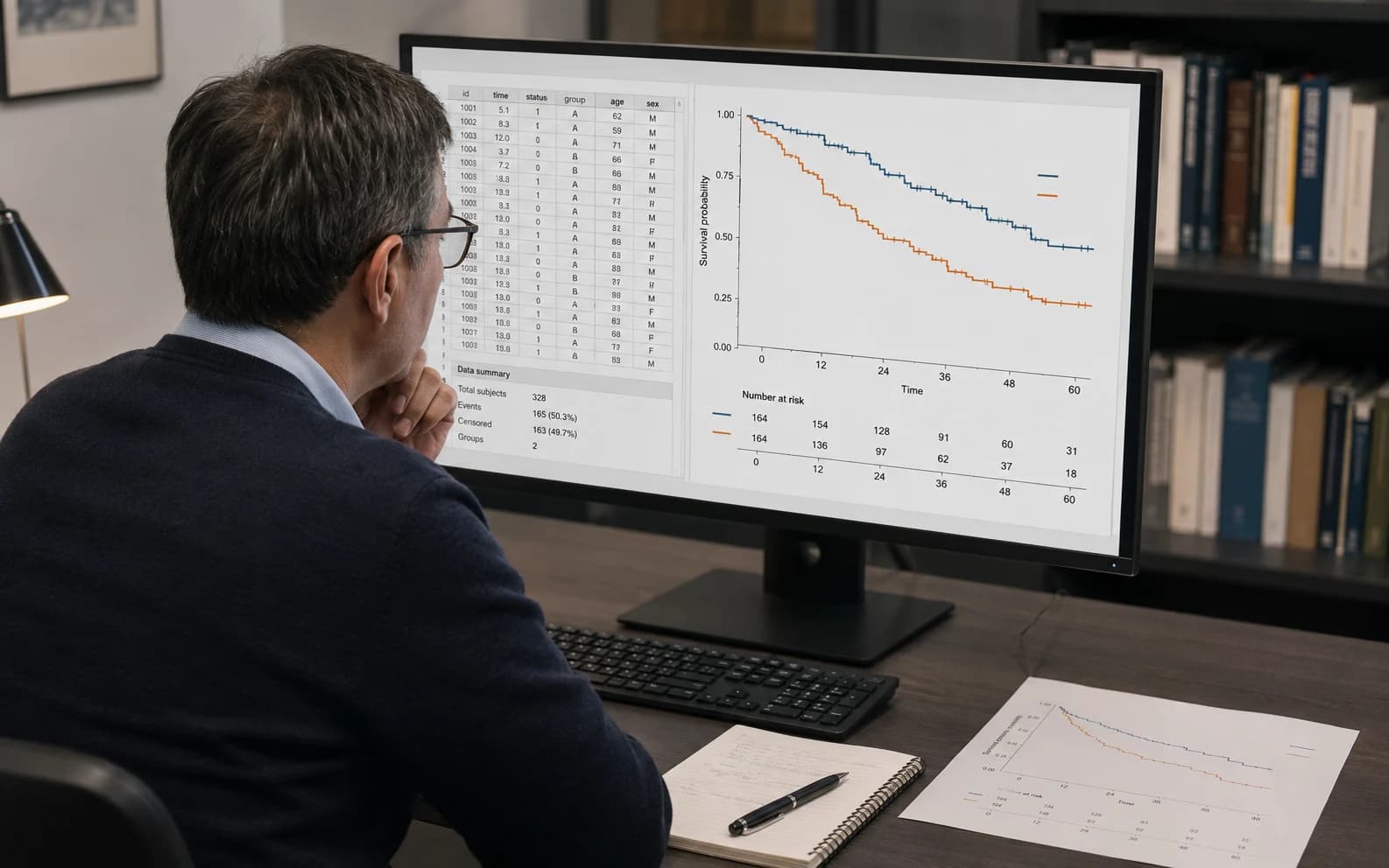
Oncology researcher reviewing a Kaplan-Meier curve and manuscript proof

Clinical and oncology research

Turn OS, PFS, DFS, infection, device-failure, or other time-to-event records into an auditable first analysis.

Clinical research team reviewing a Kaplan-Meier figure during manuscript revision

Manuscript and supervisor review

Update a time window, risk table, confidence band, or label without rebuilding the analysis in another application.

Biostatistician checking survival data and a Kaplan-Meier curve

Statistical quality checks

Inspect event coding, invalid rows, group sizes, event counts, medians, and the risk-set tail before export.

Kaplan-Meier maker capabilities

A Survival Analysis Workflow, Not Just a Line Chart

Every visible curve stays connected to the participant data, risk sets, uncertainty, and exportable statistics that produced it.

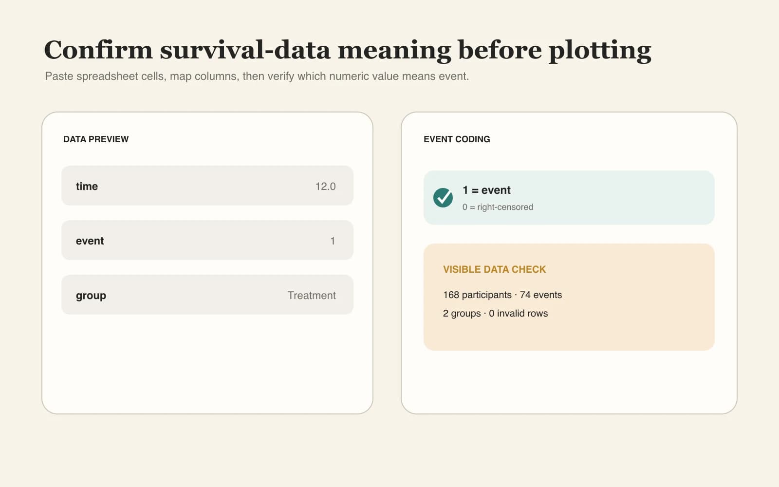
Map time, event, and group without guessing

Paste directly from a spreadsheet or upload CSV/TSV. The tool requires time and event headers, supports common event words, and keeps numeric 0/1 semantics explicit.

Try the Kaplan-Meier Curve Maker
Survival data mapping workflow for time event and group columns

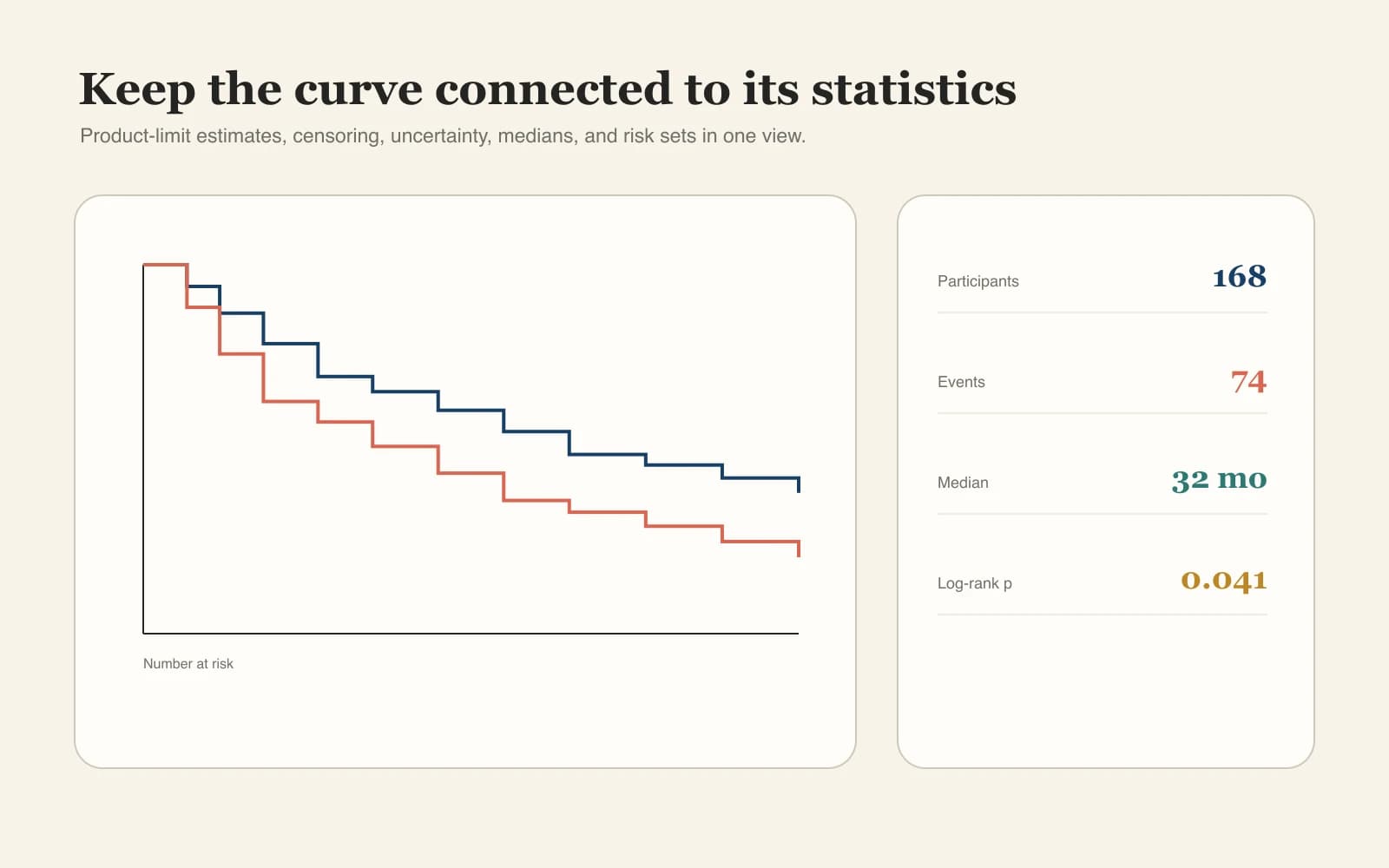
Compute the survival statistics researchers expect

Generate product-limit steps, censoring marks, Greenwood log-log confidence intervals, median survival, risk sets, and a multi-group log-rank test from one dataset.

Try the Kaplan-Meier Curve Maker
Kaplan-Meier statistical workflow with confidence intervals and risk sets

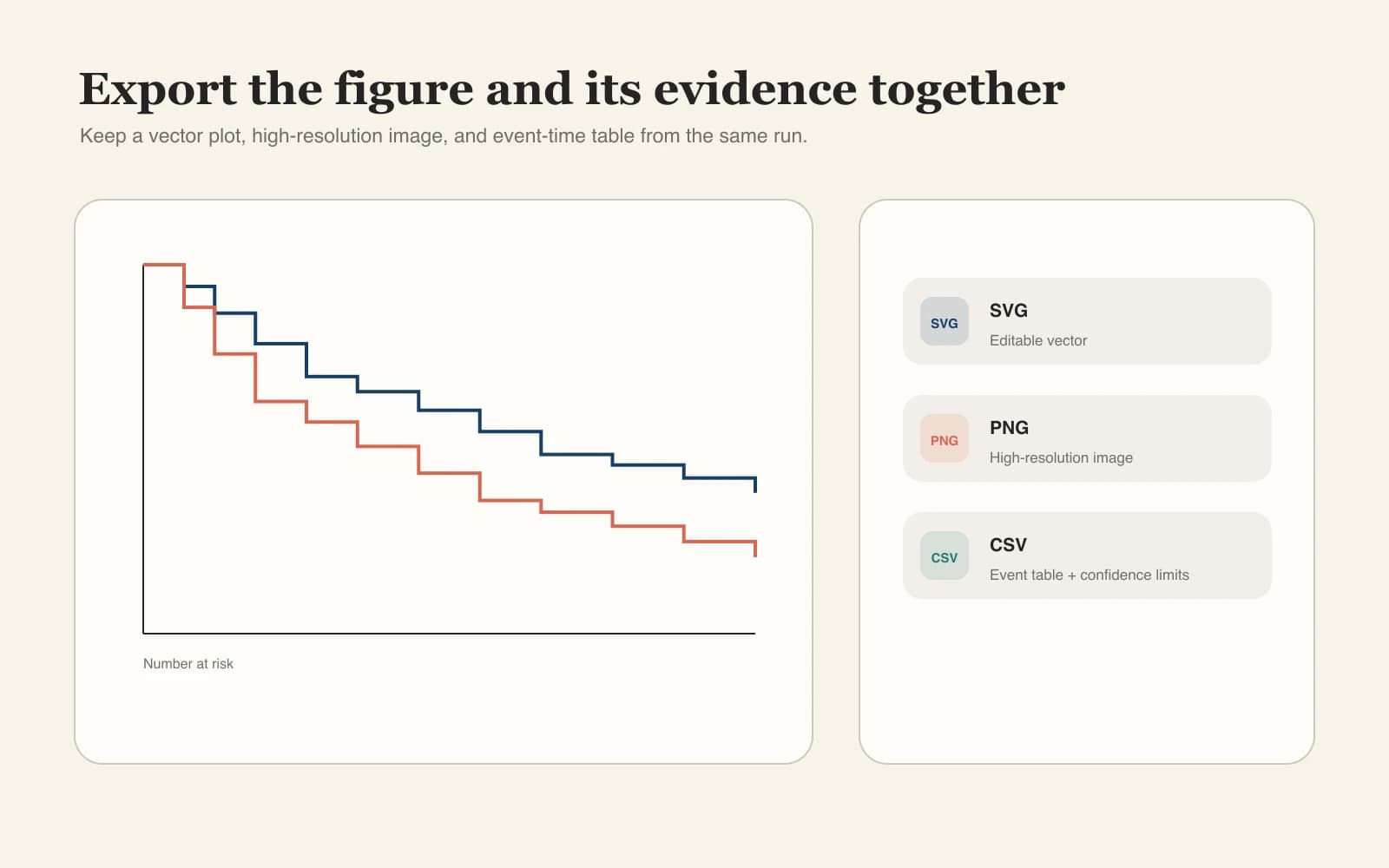
Export a figure and its evidence together

Download editable SVG, high-resolution PNG, and a CSV event table containing risk counts, events, censoring, survival, and confidence limits.

Try the Kaplan-Meier Curve Maker
Publication export workflow for Kaplan-Meier SVG PNG and statistics CSV
Statistical guardrails

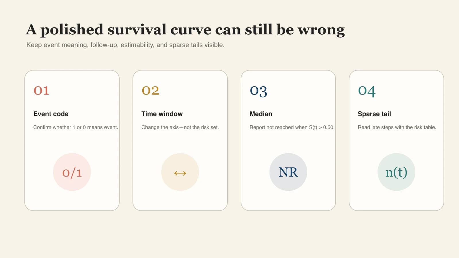
Catch the Mistakes a Polished Curve Can Hide

A chart can look plausible even when event coding, filtering, or interpretation is wrong. The generator keeps high-risk assumptions visible beside the result.

Confirm what 0 and 1 mean

Choose the numeric event convention explicitly. Text values such as dead, alive, event, and censored are also recognized.

Change the x-axis without deleting follow-up

The display time limit never removes later records or changes who belongs to an earlier risk set.

Report a median only when it is reached

If the survival curve never falls to 0.50, the result is labeled not reached instead of showing a fabricated value.

Keep sparse tails and small event counts visible

The risk table and warnings provide context when late estimates depend on very few participants.

Kaplan-Meier statistical quality assurance checklist
Input validation and interpretation warnings stay visible before publication export.QA built in

Why researchers use it

Faster Than Rebuilding Survival Curves by Hand

Move from a spreadsheet to a reviewable figure without hiding the choices that determine the analysis.

Browser based

No installation

Run the complete workflow in a modern browser without configuring R, Python, or a desktop statistics package.

Data stays local

Local-first privacy

Participant rows remain in the browser during parsing, calculation, preview, and download.

Fewer silent errors

Clear event coding

A dedicated control makes the event and censoring convention explicit before results are interpreted.

Ready to review

Aligned risk table

Risk counts use the same time scale and group colors as the survival curves above them.

Publication oriented

Vector output

SVG remains crisp in manuscripts, slides, and downstream figure editing workflows.

Auditable output

Statistics CSV

Keep event-time survival estimates, confidence limits, events, censoring, and risk counts with the image.

How to make a Kaplan-Meier curve

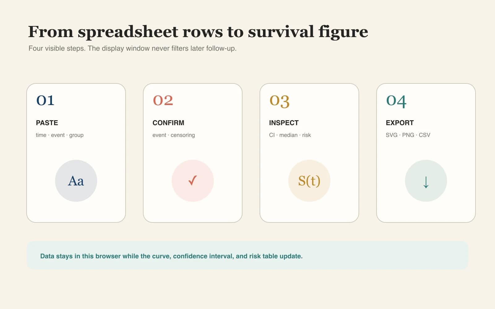
From Excel Rows to a Finished Survival Plot

Four visible steps keep data preparation, event meaning, interpretation, and export connected.

01

Paste or upload participant data

Use one row per participant with time, event, and an optional group column.

02

Confirm the event code

Choose whether 1 or 0 means the endpoint occurred; review invalid rows before continuing.

03

Inspect the curve and risk table

Check censoring, confidence intervals, group sizes, medians, log-rank p-value, and sparse tails.

04

Export the figure and statistics

Download SVG or PNG for the manuscript and retain the statistics CSV for review and reproducibility.

Use Kaplan-Meier Curve Maker
Four-step workflow for creating a survival plot with Kaplan-Meier Curve Maker
The display time limit changes the figure only; it never filters later follow-up records.

Continue the analysis workflow

Related Clinical Research Figure Tools

Build the evidence flow, summarize study effects, inspect publication patterns, or check the finished figure.

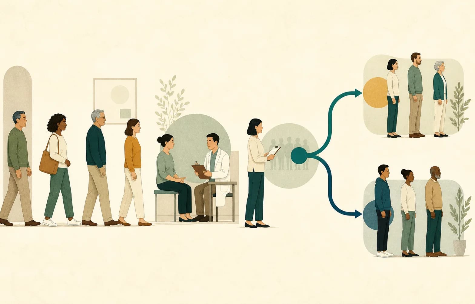
CONSORT participant flow diagram for a randomized clinical trial

CONSORT Flow Diagram Generator

Report recruitment, randomization, follow-up, and analysis for a randomized trial.

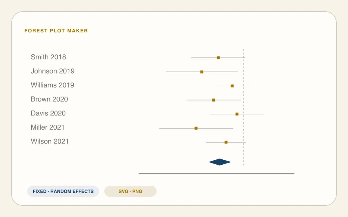
Meta-analysis forest plot with pooled effect diamond

Forest Plot Maker

Summarize effect estimates and confidence intervals across studies.

Meta-analysis funnel plot with confidence boundaries

Funnel Plot Maker

Inspect effect estimates against study precision and explore asymmetry.

Journal figure quality checker report

Journal Figure Checker

Check image dimensions, format, and resolution before submission.

Kaplan-Meier curve maker FAQ

Kaplan-Meier Curve Maker FAQ

What data do I need for a Kaplan-Meier curve?+

The required input is one row per participant with a non-negative follow-up time and an event status. Add an optional group column for treatment or cohort comparisons. Before analysis, confirm whether 1 means event and 0 means censored, or whether your dataset uses the reverse convention.

Does 1 mean event or censored?+

Either convention can appear in real datasets, so you must confirm it explicitly. Select 1 = event and 0 = censored, or reverse the mapping when that matches your source data. The parser also recognizes words such as event, dead, alive, and censored, but you should still review the result.

How do I make a Kaplan-Meier curve from Excel without R?+

Copy the header row and participant rows from Excel or Google Sheets, then paste them into the data field. Keep time and event as separate columns and add group when needed. You can also upload CSV or TSV. The browser calculates and redraws the curve without requiring R, Python, or desktop software.

How are censored observations shown?+

A censoring mark appears on the curve at the survival probability current when that participant’s follow-up ended. Censoring removes the participant from later risk sets but does not create a downward survival step. When events and censoring share a time, events are handled before censored records leave the risk set.

What does median survival not reached mean?+

Median survival is the first time the estimated survival probability reaches or falls below 0.50. If the curve remains above 0.50 throughout observed follow-up, the median is not reached. Report it as not reached rather than substituting the ordinary median follow-up time or extending the curve beyond the observed data.

How is the number-at-risk table calculated?+

At each displayed time point, the table counts participants whose recorded follow-up time is at least that time. This is the risk set immediately before events at the selected point. The table uses the complete dataset, so shortening the visible x-axis does not delete later follow-up or alter earlier risk counts.

Can I compare more than two groups with a log-rank test?+

Add a group column containing two or more labels. The generator draws one curve per group and reports a global log-rank test with k−1 degrees of freedom when the covariance matrix is estimable. It does not report pairwise tests or adjusted hazard ratios, which require a separate prespecified analysis.

Can I use Kaplan-Meier Curve Maker for publication without uploading clinical data?+

The tool parses, analyzes, and draws participant rows in your browser rather than uploading them. Export SVG or high-resolution PNG for figure preparation and keep the statistics CSV for review. Remove direct identifiers, follow institutional data policy, and independently verify the analysis, labels, assumptions, and target-journal requirements before publication.

Browser-based survival plot generator

Create Your Kaplan-Meier Curve in the Browser

Paste time-to-event data, confirm the censoring code, inspect the risk table and uncertainty, then export the figure with its statistics.

Start Kaplan-Meier Curve Maker