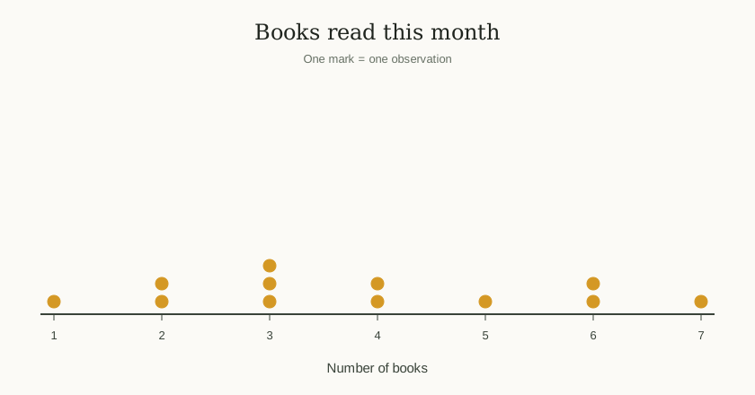
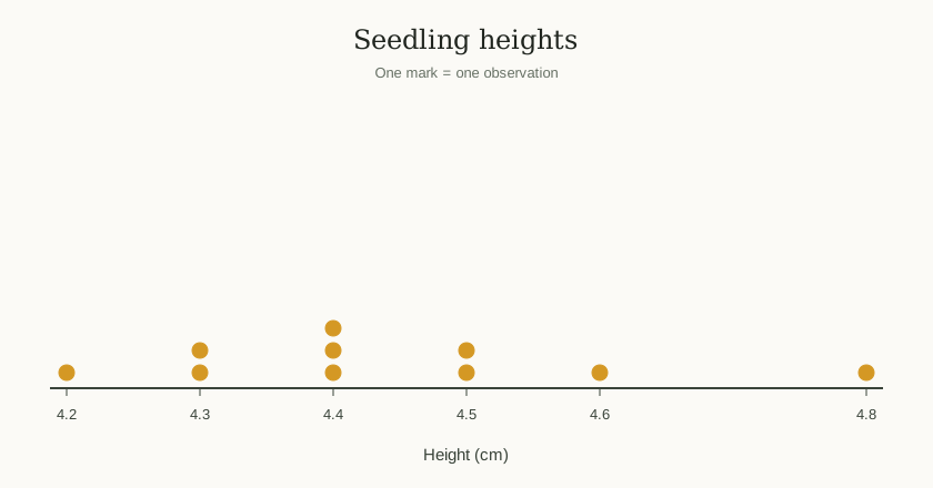
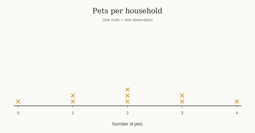
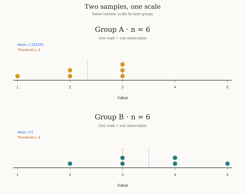
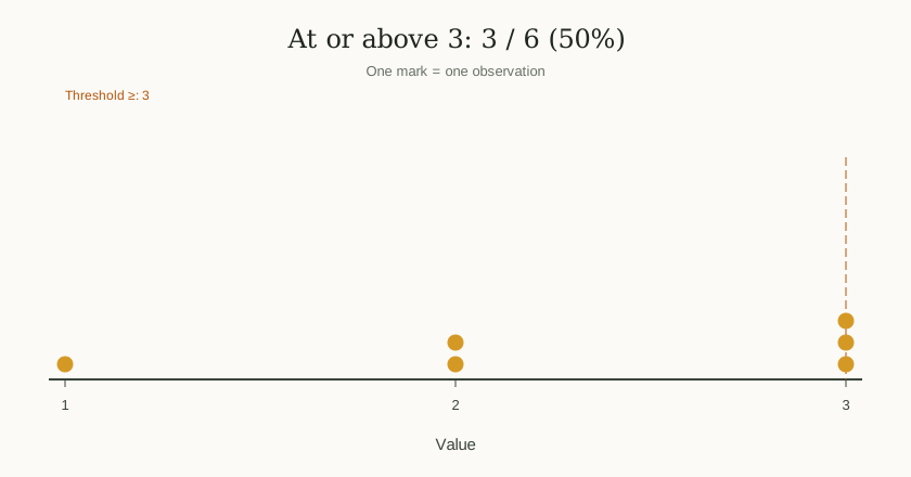
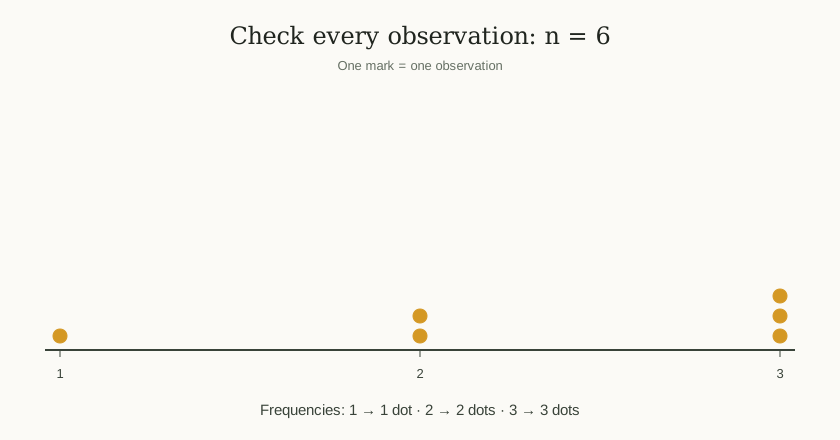
A frequency dot plot shows the distribution of one numeric variable. Each dot represents one observation. Values run along a number line, and repeated values stack vertically so you can see clusters, gaps, and unusually high or low values.
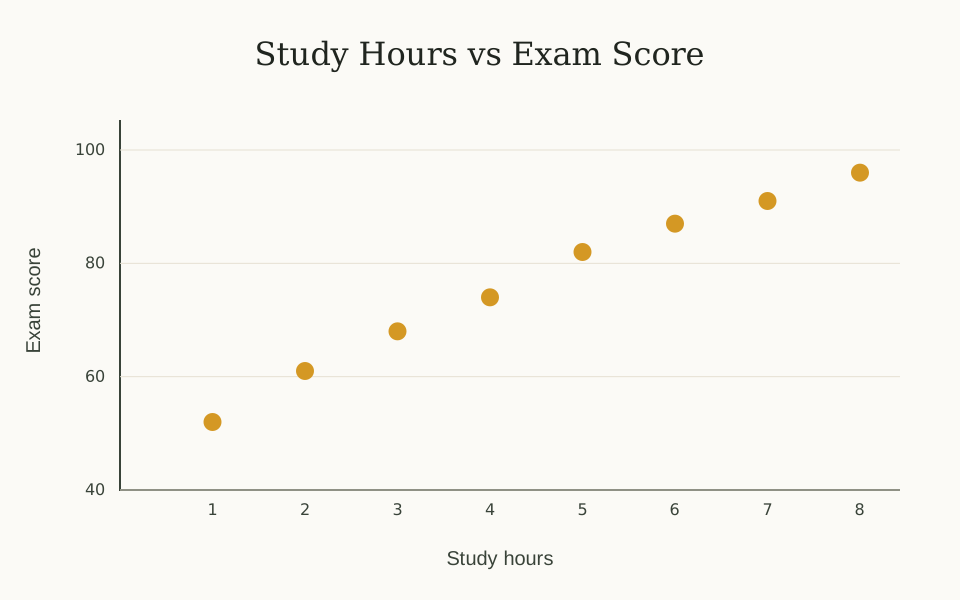
Use this dot plot maker for small datasets, classroom line plots, and exploratory measurement summaries. A scatter plot is a different chart: it compares two numeric variables using x–y pairs.
01
One variable
Enter a single list of numbers, such as counts, scores, or measurements.
02
Frequency through stacking
Three identical values produce three marks at the same numeric position.
03
Numeric spacing
Horizontal distances reflect differences between values, not row order.