• Logo
    PaperBananaAI Academic Illustration Generator
Home
  • Home
  • Studio
  • Scientific Illustration Generator
  • Poster Maker
  • Diagram Maker
  • Figure Editor
  • Pricing
My Creations
  • My Creations
  • Invite Friends
LogoPaperBanana
HomePricingInvite Friends
LogoPaperBanana

PaperBanana - AI-powered academic illustration generator

support@paperbanana.me

AI Tools

  • All Tools
  • Text to Illustration
  • Scientific Illustration Generator
  • Figure Editor
  • Diagram Maker
  • Poster Maker

Support

  • About
  • Pricing
  • Contact

Legal

  • Privacy Policy
  • Terms of Service
  • Acceptable Use

© 2026 PaperBanana. All Rights Reserved.

PricingContact
Online heat map maker — no login

Heatmap Generator for Excel, CSV, and Data Matrices

Use this Heatmap Generator to paste a labeled matrix from Excel or upload CSV/TSV data. Normalize rows or columns, cluster similar patterns, inspect missing values, and export SVG, PNG, or ordered CSV—without writing code, signing up, or adding a watermark.

Paste Excel or upload CSV/TSVRow and column Z-score normalizationHierarchical clustering and dendrogramsNo code, no signup, and no watermark

Enter a Matrix and Choose Heatmap Settings

Put row names in the first column and column names across the first row. Blank, NA, NaN, null, and “-” cells are treated as missing.

Copy directly from Excel or Google Sheets, or paste comma-, tab-, or semicolon-separated data.

gene-expression.csv

The matrix is valid. Confirm normalization, clustering, and color scale before reporting.

Your matrix is parsed, transformed, clustered, and rendered in this browser. This tool does not upload it.

Live heatmap and method summary

8
Rows
6
Columns
0
Missing
-1.19–1.26
Range
Normalization: row-z · Hierarchical clustering: both · Distance metric: correlation

Z-scores use the population standard deviation. Clustering uses average-linkage agglomeration with the selected Euclidean or correlation distance.

Heatmap basics

What a Data Heatmap Shows

A data heatmap is a color-coded grid for a two-dimensional numeric matrix. Rows and columns remain discrete categories, while the color scale makes high, low, similar, and unusual patterns visible without reading every number. It is useful for gene expression, correlation, classification, activity, and business data.

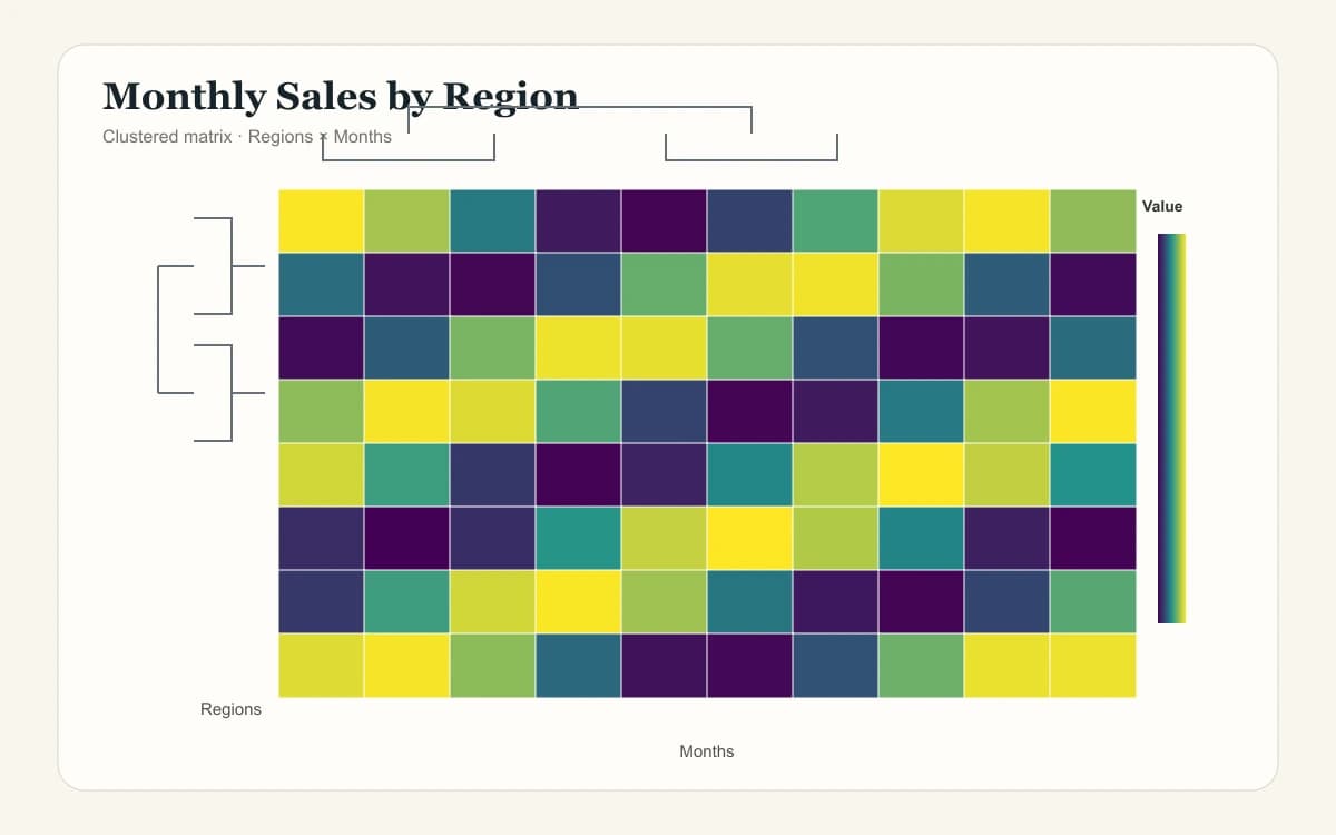
Sequential palettes suit values that progress from low to high. Diverging palettes suit values around a meaningful midpoint such as zero, change from baseline, or a Z-score. The legend is part of the evidence: it must state what the colors mean.

Clustering can reorder rows or columns so similar profiles sit together. A dendrogram records that ordering, but it does not prove biological or causal groups. Interpret clusters alongside the study design and source data.
01

Matrix

Rows and columns define the observations or variables being compared.

02

Color scale

A legend maps numeric values to color and identifies the midpoint.

03

Normalization

Row or column Z-scores change the question from magnitude to relative pattern.

04

Clustering

A distance metric and linkage rule reorder similar profiles together.

Methods and references

Make Heatmap Scaling and Clustering Reproducible

A heatmap can change substantially with scaling, distance, linkage, and color limits. Record each choice in the figure caption or methods section.

Reference documentation reviewed: September 2026

ReferenceTopicWhat to verifyDocumentation

Reference

SciPy

Topic

Hierarchical clustering

What to verify

Verify the distance metric, average-linkage method, and leaf order used for the dendrogram.

Documentation

linkage

Reference

R stats

Topic

Scaling

What to verify

State whether values were centered and scaled by row or column before plotting.

Documentation

scale

Reference

Matplotlib

Topic

Color mapping

What to verify

Choose a sequential or diverging colormap that matches the numeric meaning and remains legible.

Documentation

colormaps

Method labels improve reproducibility but do not replace validation against the analysis code or source matrix.

Heatmap Examples for Research and Data Analysis

Load any example into the maker to inspect its raw matrix, normalization, clustering order, missing values, and color scale.

Built for real matrices

Heatmaps for Gene Expression, Correlation, and Excel Data

Use one transparent workflow for exploratory analysis, teaching, reporting, and figure preparation.

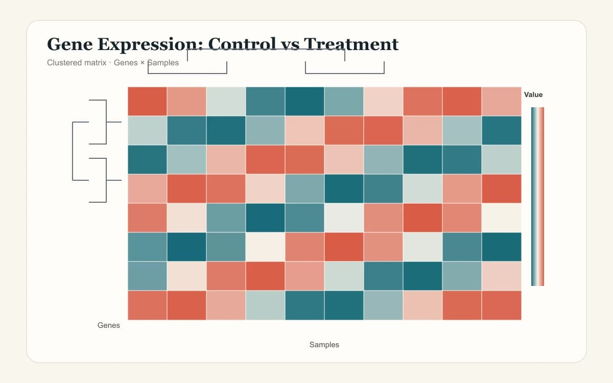
Researcher reviewing a clustered gene expression heatmap

Biomedical and omics researchers

Compare genes, proteins, metabolites, samples, and treatment conditions with row scaling and clustering.

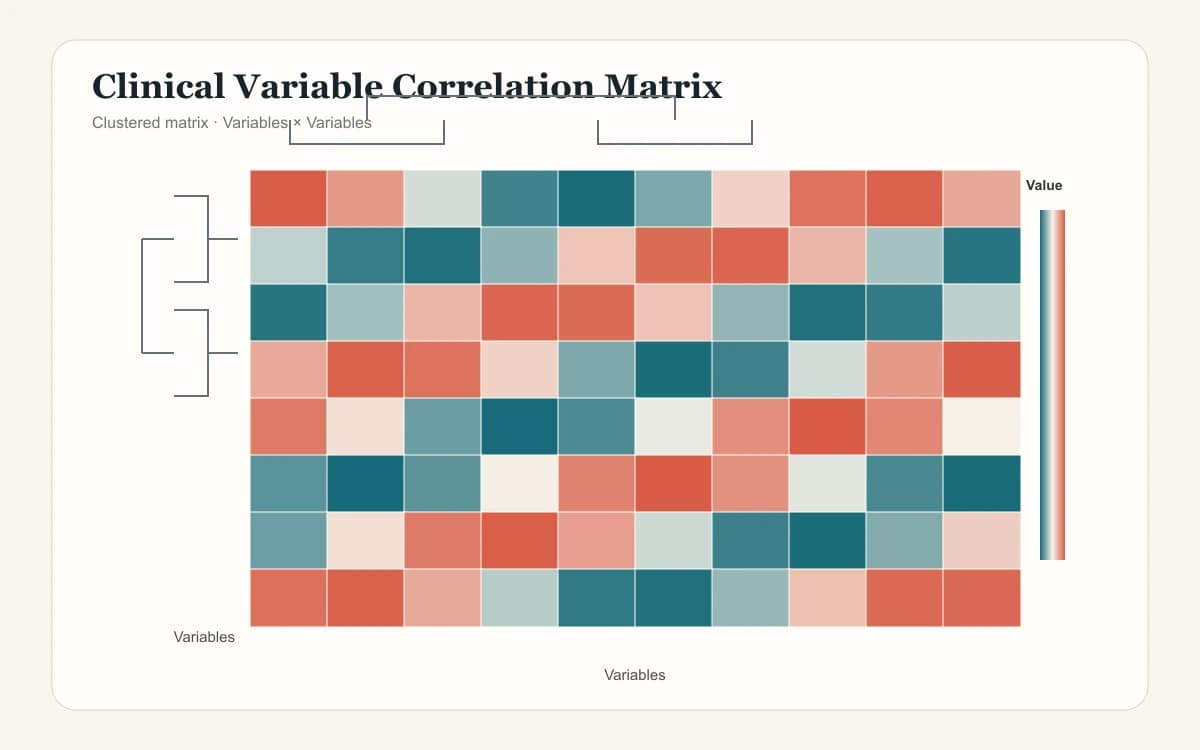
Data scientist inspecting a correlation matrix heatmap

Statisticians and data scientists

Visualize correlation matrices, confusion matrices, and multivariate features without hiding numeric values.

Analyst creating a heatmap from Excel data

Excel and CSV analysts

Move directly from a spreadsheet matrix to an ordered, shareable visual and exportable data table.

Heatmap Generator capabilities

Heatmap Maker Features for Excel, CSV, and Clustering

Turn a labeled matrix into an auditable chart while keeping every transformation visible.

Turn an Excel or CSV Matrix into a Heatmap

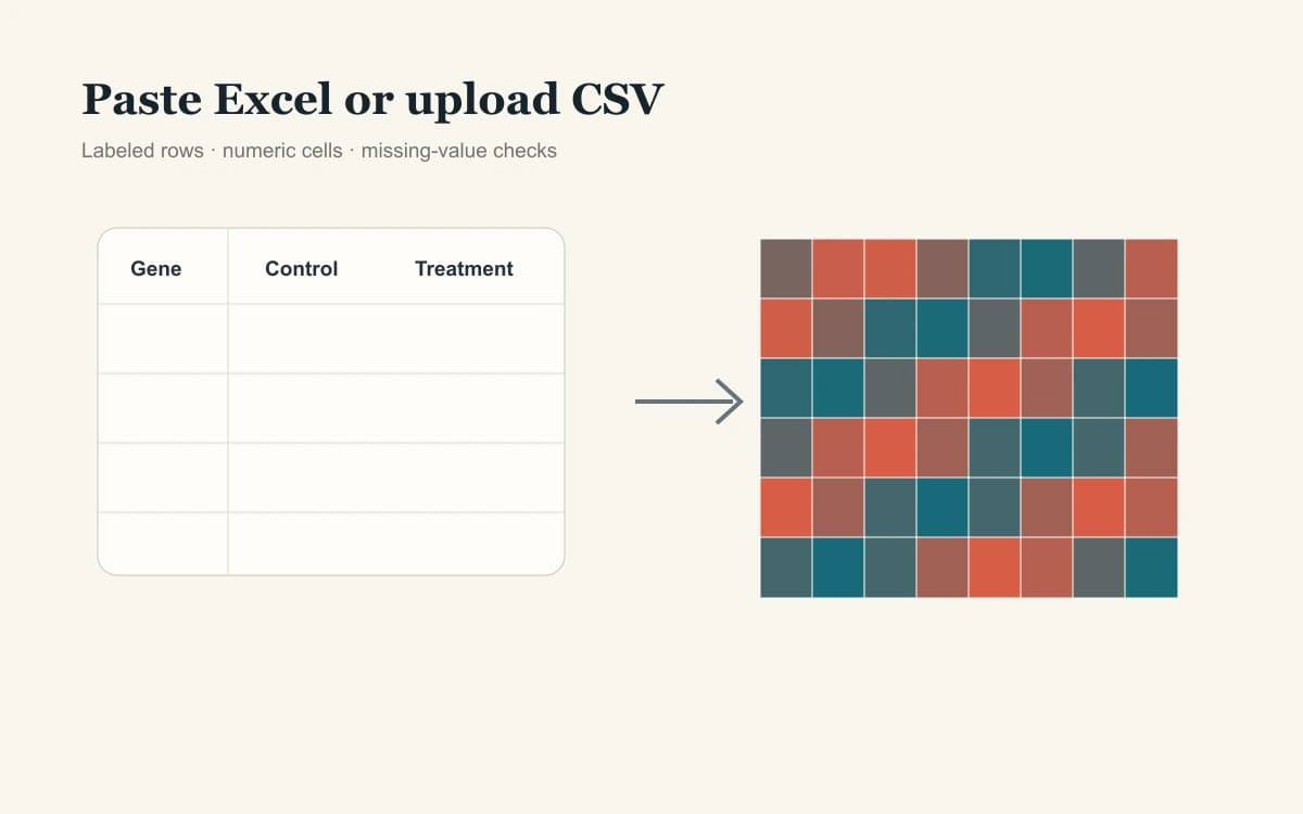
Paste spreadsheet cells or upload a file to get a labeled heat map without reshaping a clean matrix. Missing cells remain visible, and unexpected text is reported before export.

Try Heatmap Generator
Heatmap Generator importing an Excel and CSV matrix

Reveal Patterns with Scaling and Dendrograms

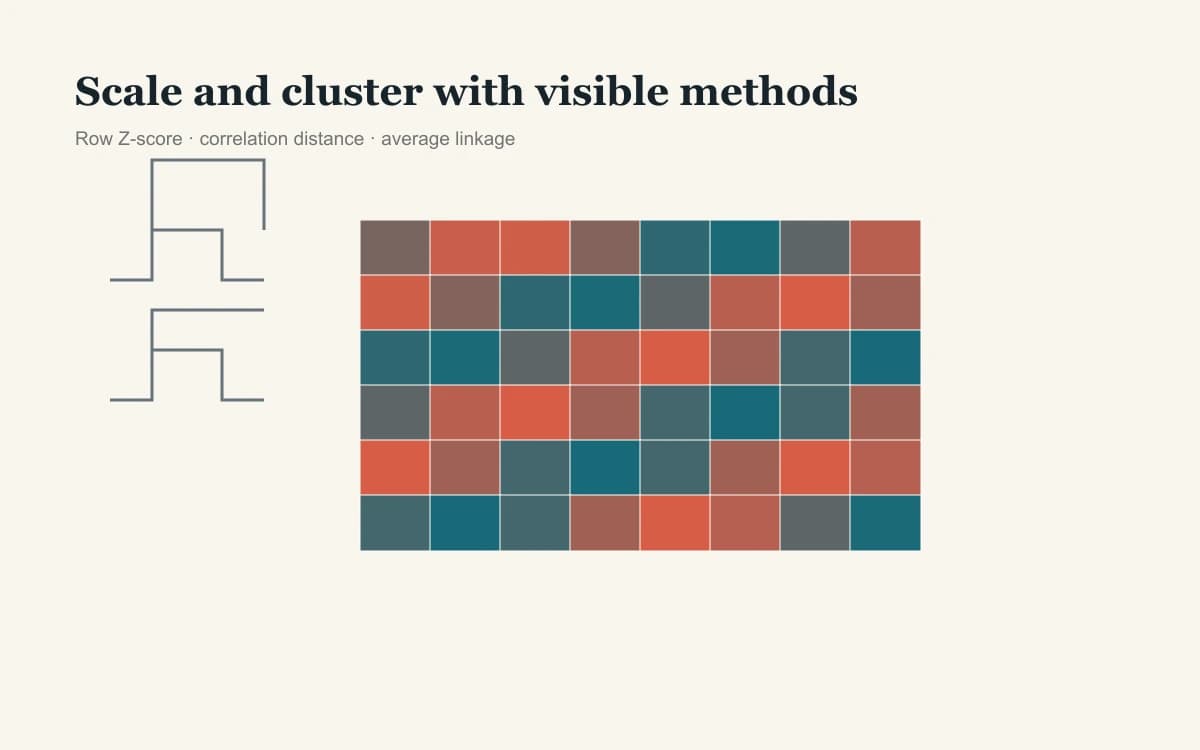
Compare relative profiles with row or column Z-scores, then group similar rows or columns with Euclidean or correlation distance and a visible dendrogram.

Try Heatmap Generator
Heatmap clustering controls with row and column dendrograms

Edit a Publication-Ready SVG without a Watermark

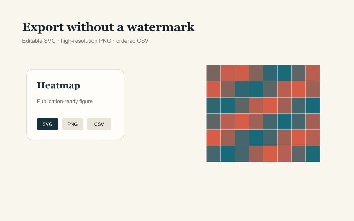
Download an editable SVG for manuscript layout, a high-resolution PNG for slides, and an ordered CSV that preserves the displayed row and column order.

Try Heatmap Generator
Heatmap export options for SVG PNG and ordered CSV
Method guardrails

How Normalization and Hierarchical Clustering Change a Heat Map

The same matrix can tell a different visual story after scaling or reordering. The generator names each decision so reviewers can reproduce it.

Raw values

Preserve magnitude and units when every row and column is directly comparable.

Row Z-score

Center and scale each row to compare relative patterns rather than absolute magnitude.

Distance

Euclidean distance compares magnitude; correlation distance emphasizes profile shape.

Average linkage

Clusters merge according to the average pairwise distance between their members.

Heatmap normalization and hierarchical clustering method guide
Scaling changes values; clustering changes order. Neither step creates new observations.Methods visible

Four-step workflow

How to Create a Heatmap from Excel or CSV

Move from a spreadsheet matrix to a labeled, exportable heat map in four transparent steps.

01

Paste or upload the matrix

Place column labels in the first row and row labels in the first column.

02

Check missing values

Review cells parsed as missing and correct any unexpected text.

03

Choose scale and clustering

Select normalization, palette, distance, and which dimensions to reorder.

04

Export chart and data

Download SVG or PNG plus an ordered CSV that matches the displayed heat map.

Start Heatmap Generator
Four steps for creating a heatmap from Excel or CSV
Keep the source matrix and method settings with the exported figure.

Continue the analysis

Related Research Visualization Tools

Choose another focused tool when your question needs distributions, effect sizes, or evolutionary relationships.

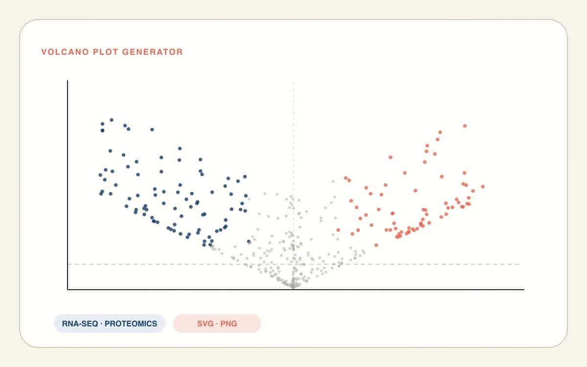
Volcano plot of differential expression

Volcano Plot Generator

Inspect differential-expression effect size and significance before selecting heatmap features.

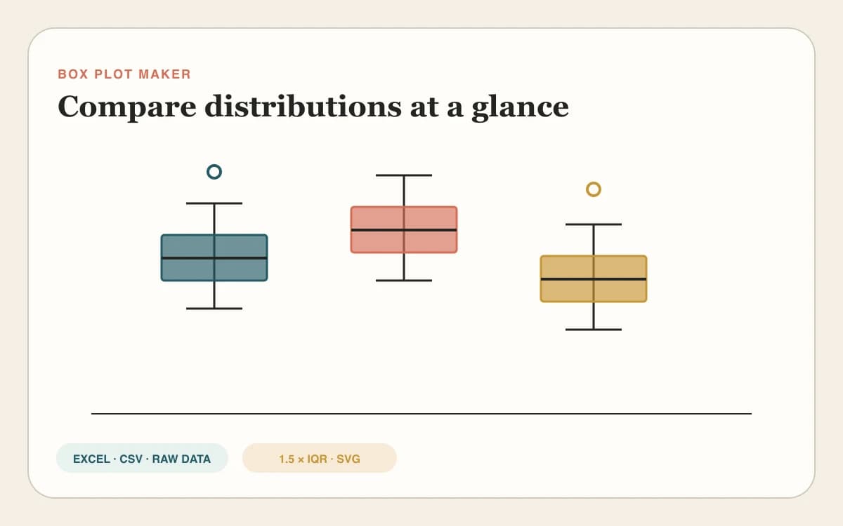
Box plots comparing group distributions

Box Plot Maker

Compare distributions for individual features identified in a heat map.

Forest plot with confidence intervals

Forest Plot Maker

Summarize effect estimates and confidence intervals across studies.

Phylogenetic tree with labeled taxa

Phylogenetic Tree Generator

Visualize evolutionary relationships when a distance matrix represents taxa.

Heatmap Generator FAQ

Heatmap Generator FAQ

How do I create a heatmap from Excel data?+

Copy a rectangular range from Excel and paste it into the Heatmap Generator. Keep column labels in the first row and row labels in the first column. The browser reads tab-separated cells automatically, preserves blank or NA cells as missing values, and updates the heat map as soon as the matrix is valid.

Can I upload CSV or paste a labeled data matrix?+

Paste comma-, tab-, or semicolon-separated matrix data, or upload a CSV, TSV, or TXT file. The first row supplies column labels and the first column supplies row labels. Blank, NA, NaN, null, and dash cells stay visibly missing instead of being silently converted to zero.

What is the difference between sequential and diverging heatmap colors?+

Use a sequential palette such as Viridis or Cividis when values move from low to high on one scale. Use a diverging blue–white–red palette when values have a meaningful center such as zero, baseline change, or a Z-score. Always keep the numeric colorbar visible when reporting the result.

How do I make a correlation heatmap?+

Create a square matrix with the same variables across the first row and first column, then paste or upload it. Keep raw correlation coefficients, choose the diverging palette so zero is the midpoint, and enable cell values when exact coefficients need to remain readable alongside the colors.

Should I normalize heatmap data by row or by column?+

Choose row Z-scores to compare each feature’s relative pattern across samples, and column Z-scores to compare relative patterns within each sample or condition. Keep raw values when all cells share comparable units and absolute magnitude matters. Record the selected normalization in the figure caption or methods section.

Does the Heatmap Generator support clustering and dendrograms?+

Cluster rows, columns, or both, then display dendrogram guides beside the reordered matrix. The tool uses average-linkage agglomeration with either Euclidean distance for magnitude differences or correlation distance for profile shape. The selected normalization, clustering dimensions, and distance remain visible beside the chart for review.

How does the Heatmap Generator handle missing values and exports?+

Blank cells and common NA markers use a neutral missing-value color, while unexpected text is counted for review. Parsing, normalization, clustering, and rendering stay in your browser. Export an editable SVG, high-resolution PNG, or ordered CSV without an account or watermark, and keep the source matrix with the figure.

Online heat map maker — no login

Create Your Heatmap in the Browser

Paste a matrix, choose normalization and clustering, verify the color scale, and export the figure with its ordered data.

Start Heatmap Generator